
Many front covers in the Naruto manga series are well designed and demonstrate good use of composition. Volume 70 in particular stood out to me with the amazing artwork and layout. The colours are vibrant and the arrangement of the characters and text are well thought out. This cover is an example of good composition on book covers because the the way the characters are arranged in the foreground guides the viewers eyes to the character in the in the middle. The red “sharingan” eye contrasts well with the rest of the cover and is placed in the middle acting like a focal point. This front cover in part particular has similar attributes to Toulouse- Lautrec’s (1890) At the Moulin Rouge, the Dance oil-on-canvas painting. The way the crowd surrounds the dancer draws you eyes to her instantly. The red tights are a focal point in the piece similar to the red eye on the Naruto cover. That pop of red instantly catches your eye with the characters acting like curtains.
The cover is well balanced, distributing visual weight evenly which is effective and engaging. Although the cover is filled with images, it doesn’t feel cluttered; the positioning creates a sense of order and organisation. The proximity of the characters show the good on the right vs the “evil” on the left with the neutral in the middle and the blue background being the “final boss” type character. The characters act like curtains covering the background which adds emphasis to how she is watching them and hidden waiting to strike. Additionally, the text being placed front and centre makes it easily recognisable and not lost within the artwork while being the colour orange which contrasts well with the blue background.
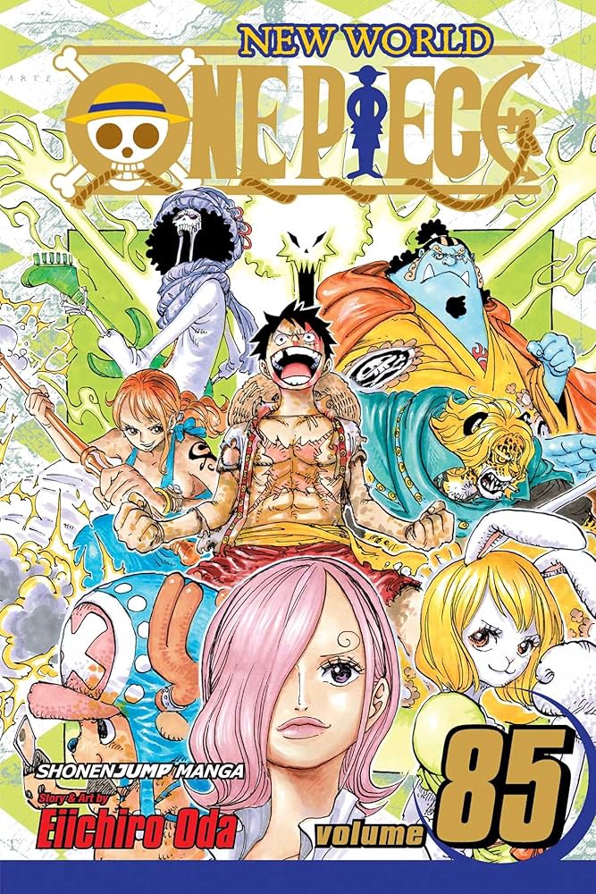
One Piece volume covers can often feel cluttered due to Eiichiro Oda’s style, which tends to include a multitude of characters and vibrant backgrounds. Oda likes to showcase the diverse cast and the plot points of that specific volume, leading to covers that are packed with action and detail. While this can create a lively and dynamic look, it sometimes results in a lack of focus, making it hard for viewers to identify a clear focal point. The energy and chaos can be part of the charm, but it can also overwhelm the overall composition.
Volume 85 in particular in my opinion has poor composition primarily because it features a large number of characters and action elements that can create a cluttered look. The various characters are positioned in a way that competes for attention, making it difficult for the viewer to focus on the main subject or theme of the cover. Additionally, the background elements can feel overwhelming, which further detracts from the overall impact of the design. The bright colours of the green and turmeric do go well together, however I think a different colour palette would match the cover better like magenta and green creating contrast that’s visually appealing.
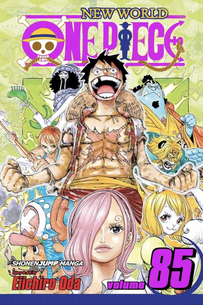
To improve the One Piece cover I tried enhancing certain elements of the original cover. This was challenging as there are many colours and characters present on the cover which made it difficult to have a main focal point. Since the main character of the series is Luffy who is the character in the middle, It made sense to make him the focal point of the cover. To achieve this I cropped him out of the original image and enlarged him to cover more of the page. This makes it easier for him to stand out as the main character. I also had to edit his legs to fit more naturally around the other characters. It’s not perfect but I think this change achieves at making him the focal point of the cover. Furthermore, although the cover still has many characters on it, having one larger than the rest creates a clear hierarchy showing the importance of the main character.
Additionally, I changed the colour of the text on the logo and volume number. I thought a bold magenta colour would stand out and is more visually pleasing than the original colour. I also slightly altered the background, I felt that it was too busy looking with the different colours. The map design in the back is quite nice and fits with the pirate theme of the manga so I wanted to keep that without drastically changing it. To do this, I created a green tinted look that kept the map design but added colour all throughout the background. I think the one solid colour makes the main artwork and logo stand out a lot better than before creating a more balanced front cover.
Figure 1. Masashi, K. (2015) Naruto, Vol. 70 (Volume 70): Naruto and the Sage of Six Paths. VIZ Media LLC. https://naruto-official.com/en/comics/01_152 [Accessed 12 Oct 2024]
Figure 2. Eiichiro, O. (2018) One Piece, Vol. 85 (Volume 85): Liar. VIZ Media LLC. https://www.amazon.co.uk/One-Piece-Vol-Eiichiro-Oda/dp/1421598205 [Accessed 13 Oct 2024]