For this project, I created a full screen web-based animation designed to act as the main feature on a landing page for Remix Vault. The goal was to introduce the brand in a way that immediately sets the tone, personality, and purpose, while staying consistent with the visual identity I had already established. I wanted it to feel immersive and engaging.
Storyboard
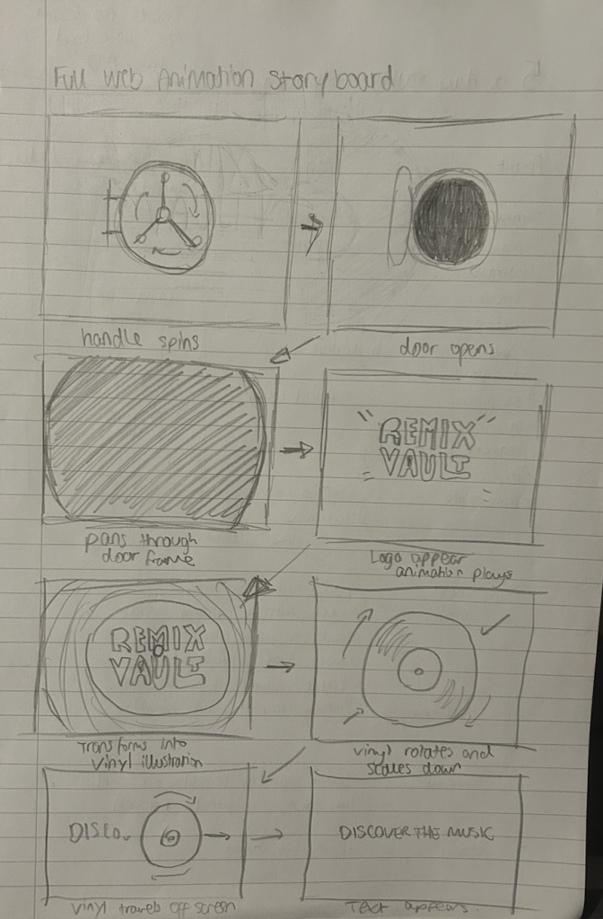
The idea developed through storyboarding, which helped me clearly map out the flow of the animation before building it. My initial concept for the name Remix Vault came from the idea of discovering music, both new and old, through curated selections. I translated this directly into the storyboard. The animation begins with a vault illustration, which then opens to reveal the logo. This moment is key, as it visually represents the idea of unlocking and discovering music, while also introducing the brand colour palette and style.
Full Screen Web-Based Animation
From there, the animation transitions seamlessly into my vinyl illustration, using the logo in the same position by fading the logo out and the illustration in. The record spins as it would on a record player, reinforcing a sense of realism within the stylised design. It then scales down into the centre of the screen before rolling off, which creates a natural flow into the next element. As it exits, text appears gradually behind it reading “Discover the music”, clearly communicating the brand’s purpose while maintaining the motion and pacing of the animation.
Throughout, I ensured that each animated element felt purposeful and connected, supporting both the tone and practicality of the brand. However, I didn’t add any audio elements as landing page animations or GIFs don’t include them either. If this were the social media animation I would’ve added audio of a vault door opening, shiny sound effects, background music etc. Overall, the final outcome reflects my original intentions by combining narrative, motion, and branding into one cohesive animation.
Desktop Mockup
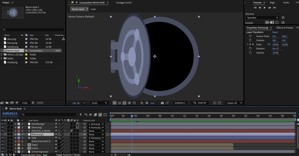
Using Adobe After Effects taught me a lot about control and precision in animation. While it felt complex and certainly didn’t come without its challenges, I learned that building from simple movements allows for greater control over pacing and intensity, resulting in a smoother, more fluid final piece. To present the animation, I also placed it within a mock website layout, including a navigation bar styled with my brand colours and logo, helping to visualise how it would function in a real landing page context.