Figjam Research Board/ Brand Development
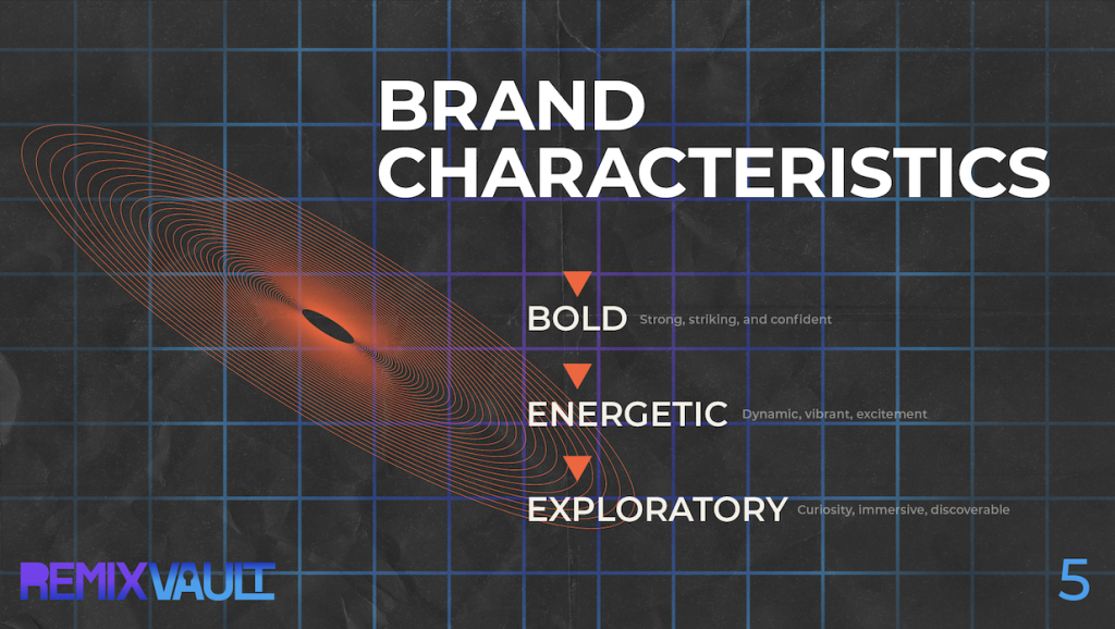
Developing Remix Vault has been a process of shaping an idea into a fully realised brand that feels both intentional and expressive. In the early stages, I focused heavily on research, understanding my target audience and building a clear user persona. I identified a music driven audience that values both nostalgia and discovery, which directly influenced the creative direction. This foundation helped guide decisions around branding, tone, and overall experience.
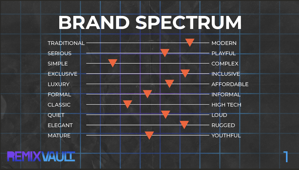
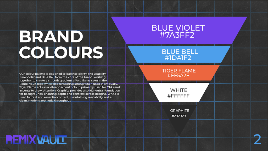
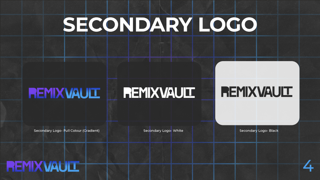
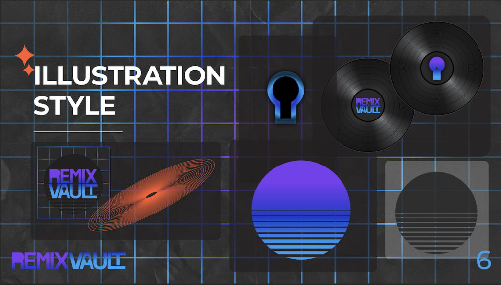
Next, I moved into creating the brand identity and guidelines. I wanted Remix Vault to feel distinctive, so I developed a retro synthwave aesthetic using blue to purple gradients. The “vault” concept became central it represents uncovering new music, discovering past classics, remixing them in a modern way. Visually, I reinforced this through elements like grids, sunset graphics, and keyhole icons. This combination creates a balance between retro inspiration and a modern edge, which is essential for a music shop rooted in both nostalgia and innovation.
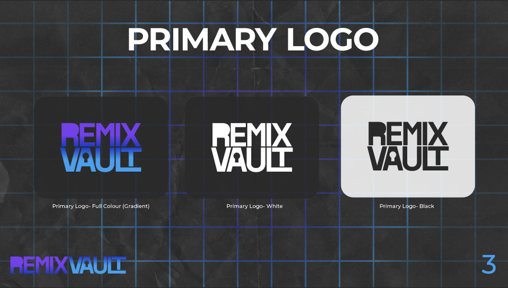
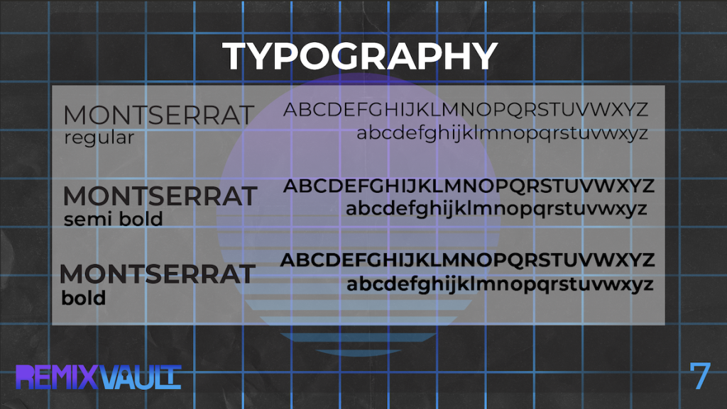
The brand guidelines brought everything together, ensuring consistency across all outputs. They defined how colour, typography, and imagery should be used, making the identity feel cohesive and recognisable.
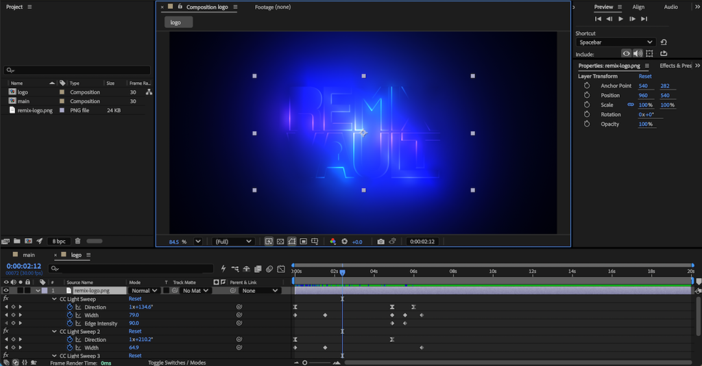
For the brand asset pack, I translated this identity into an animated brand asset pack using Adobe After Effects. The animated logo captures a neon light aesthetic, inspired by signage in music shops and clubs. It uses flashing light effects to gradually reveal the full logo, creating a high energy animation. The form and layout are clean and geometric, allowing it to remain legible while still carrying that glowing, high energy feel. The flashing animation then enhances this by revealing the logo in stages, almost like a sign powering on, which reinforces the immersive, nightlife-inspired vibe.
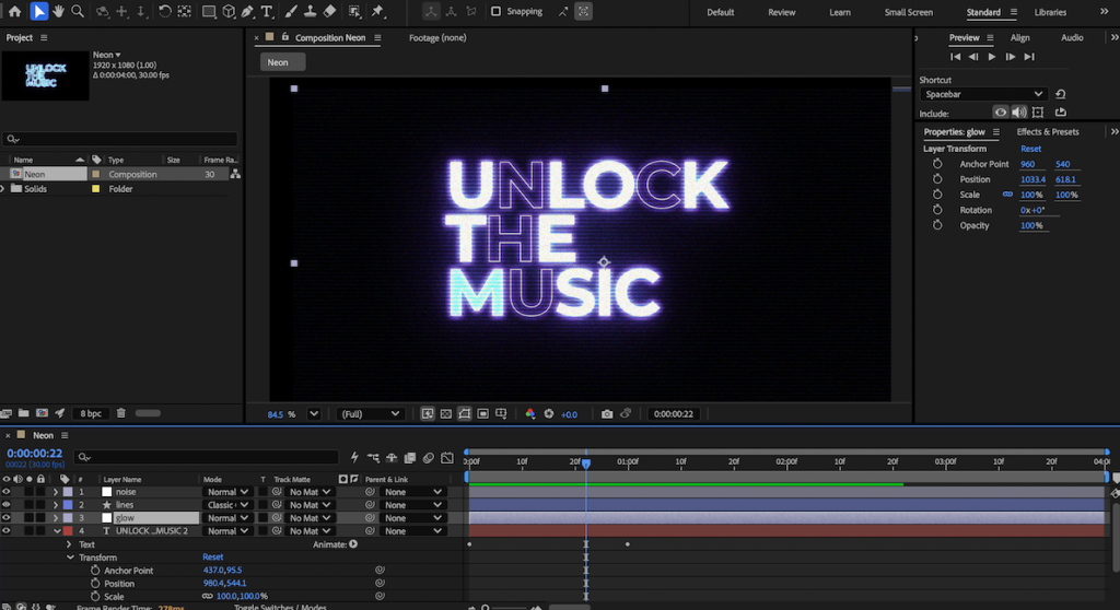
The typography builds on this further. I selected and styled type that feels modern but with subtle retro influence, making sure it aligns with the synthwave direction showing the brand tagline. In motion, the flickering neon effect combined with a grainy, vis style texture gives it character and depth, making the text feel alive rather than purely functional. This helps maintain consistency with the logo while also strengthening the overall atmosphere of the brand.
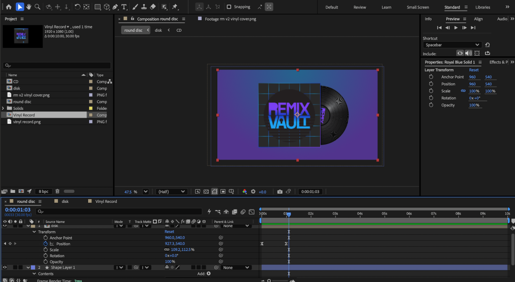
Finally, the animated illustration shows a vinyl sleeve and record entering the frame, with the record spinning like it would on a record player. Using position and rotation animation made this feel dynamic and realistic. Altogether, these assets bring Remix Vault to life as a brand that feels immersive, nostalgic, and current.