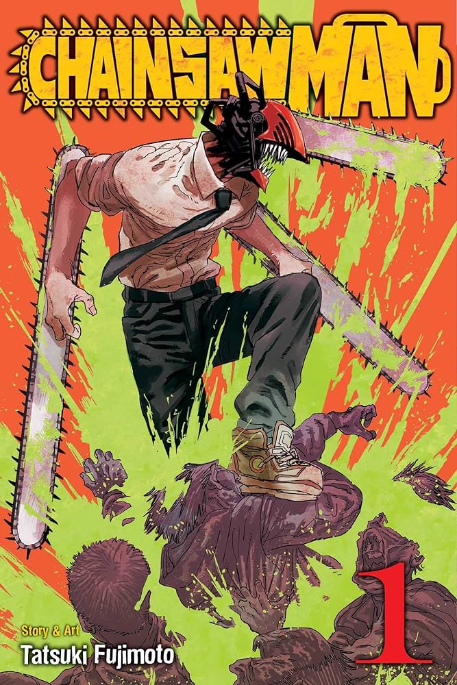
The Chainsaw Man series has some great front covers and each one uses a nice variety of vibrant and bold colours. The first volume needs to catch your eye and the use of colour on this volume is really interesting to me for several reasons. I like the high amount of detail put into Denji (chainsaw man) and how he is fully coloured while the devils that he is stood on are different shades of one colour. This really highlights Denji in the cover easily making him the focal point which is important when identifying the main character. Additionally I like how the blood is green which stands out more against the bright orange background creating a unique visual contrast that’s interesting and eye catching. I think the green blood could emphasise the idea that the devil like creatures are unnatural and not human hence being green rather than red, or it could be a unique design choice of using alternate colours to set the series apart from others. The black outlines and shadows on the text make it easy to read against the vibrant background. The bold colour scheme is also quite dirty which match the manga’s overall aesthetic of violence and danger, perfectly setting the tone for the series.

Manga cover designs can be very subjective when it comes to the design, and what could be seen as a “poor” design can vary due to viewers personal taste. Colour comes under this category and while many people like and appreciate the simple style of the Bleach covers, I find that they are not very eye catching due to the white void backgrounds. I understand that the simple design is intentional and can be a good way of highlighting the character illustration, but I think the lack of colour in the background makes it look unfinished and empty. Furthermore, the white background doesn’t have any meaning, I think adding a background colour or texture linked to the character shown on that specific volume would give it a sense of individuality and make it more interesting visually. A coloured background could add depth to the cover and using a colour that contrasts well with the artwork and title would match the excitement of the manga while still staying with that minimalist style.

I used the word “reworked” because I feel that my design and colour choice isn’t necessarily better than the original but an alternate way of using the minimalist style the original design had but with different colours. There are a few reasons why I thought a blue background would work well with this design, firstly blue is the complementary colour of orange which makes the orange hair the focal point of the cover along with the sword. The blue makes the orange hair and dark outfit stand out, enhancing the visual contrast, making it more striking. I decided that a blue, red and white colour scheme would work well at making the art work pop and look visually balanced.
Secondly, I added shadows in places on the logo and character to add more depth rather than a flat piece like the original. The blue colour also represents Ichigo’s (the main character) Reiatsu which is his aura colour when fighting early in the series. I am aware that the blue background clashes with the blue on the logo, however I think the addition of the shadows separates it enough so it doesn’t look lost in the background. Finally, I changed the colour of the volume number and author from yellow to white. This was to match the colour scheme of the logo and the red boarder still makes it stand out.
To create this design I used procreate to make the blue background, shadows and change the colour of the text.
Figure 1. Tatsuki, F. (2020) Chainsaw Man, Vol. 1 (Volume 1). VIZ Media LLC. https://chainsaw-man.fandom.com/wiki/Volume_1 [Accessed 18 Oct 2024]
Figure 2. Tite, K. (2004) Strawberry and The Soul Reapers (Bleach). VIZ Media LLC. https://www.amazon.co.uk/Strawberry-Soul-Reapers-Bleach-Tite/dp/1591164419 [Accessed 21 Oct 2024]