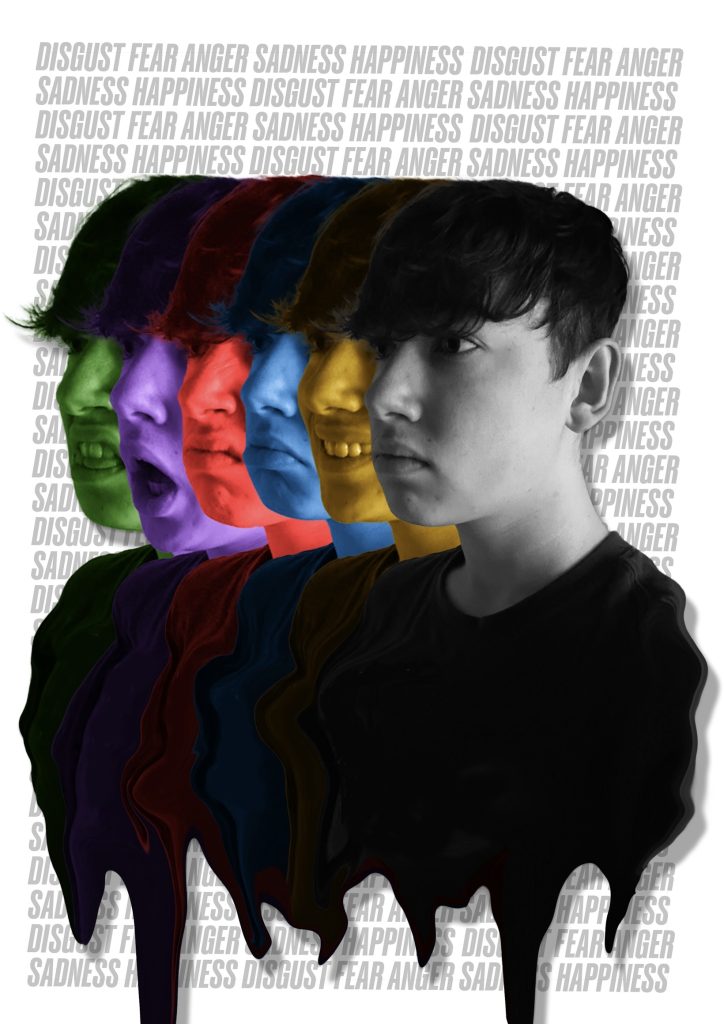
My first photoshop portrait was designed to show various emotions that humans express and how they can be over-shadowed by a neutral expression. Each emotion is further symbolised by colours commonly associated with them, for example happiness can be represented as yellow and sad can be associated with the colour blue. Inspired by the characters from the film “Inside Out” (Walt Disney Studios Motion Pictures, 2015). Finally, I merged all the images together using the liquify tool to represent how the emotions are different but connected.
To create the image I took a photo of each emotion and tinted the images with the corresponding colour then overlayed each one. Next, I created a melting effect to further signify the connection to the neutral emotion. The background is a typographical pattern with the names of each emotion, this is grey to not distract the eyes from the colour in the foreground. To finish, I added a drop shadow to create some depth making the portrait less flat and not lost in the busy background.
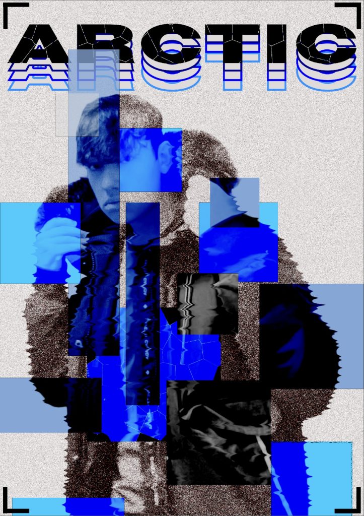
My second photoshop portrait was designed to symbolises the cold, winter time. I wanted the portrait to have an edgy and abstract look to it. The geometric shapes layered on top of my portrait create a nice pattern and they have been coloured different shades of blue to symbolise ice and black ice. That’s what makes it so abstract is how the blue shapes look like ice without actually looking like it. Furthermore, to create this effect I used the colour burn filter which makes the image underneath appear that colour of the shape. This also smoothed out the noise filter I added and that gives my portrait a grainy look which reminded me of snow. I also used the liquify tool to create a “shiver” effect on my body further representing the effects of cold weather.
Additionally, the coat I’m wearing in the portrait makes me think of the word “arctic” so I added it at the top and gave it this cracked effect to make it look frozen. The way the black word fades into blue also links to how it’s being frozen which is why it’s repeated. Finally, I added a camera lens graphic in the corners to symbolise that my picture is being taken.
Figure References
Figure 2. Walt Disney Studios Motion Pictures (2015) Inside Out https://en.wikipedia.org/wiki/Inside_Out_(2015_film) [Accessed 11 Dec 2024].