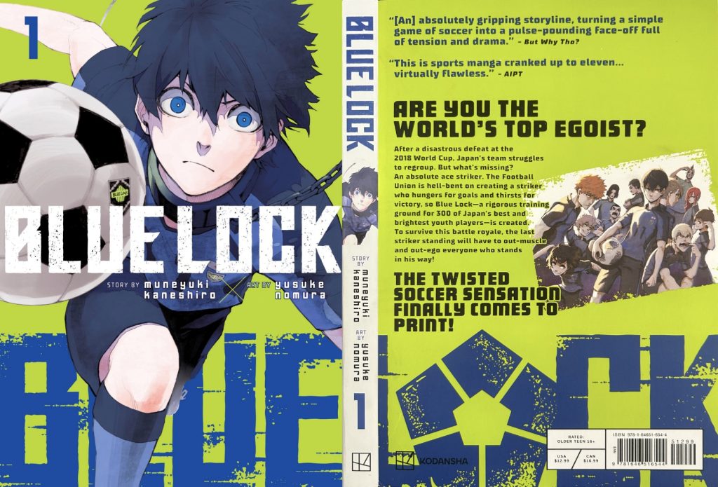
I have chosen manga comic books as my subject with the aim to understand and promote these books for viewers entertainment. The Blue Lock manga is a Japanese series based on football and is about creating the next worlds best striker. On the front cover it features the main character Yoichi Isagi. The typography on the Blue Lock volume 1 cover is quite effective. The title “Blue Lock” is bold and large making it easy to read and recognisable. The font style has a modern, sporty feel that aligns well with the themes of competition and football. The manga logo uses a unique, custom font that gives it a distinct feel that reflects the intensity of football. The sharp angles and boldness of the letters contribute to the overall dynamic feel of the cover, helping it stand out. Also, the colour contrast between the title and the background helps the logo pop but not distract the reader from the rest of the cover, enhancing the visual appeal and complements the artwork, which is consistent on all volumes throughout the series.
The title “Blue Lock” is also present in the background on a much larger scale which wraps the whole cover. This logo substitutes the “O” in Lock for the symbol logo of the series which is the layout of the Blue Lock training building from a top view which was smartly done and doesn’t make the title any less recognisable and completes the cover as a whole. The back cover is organised and uses two similar fonts which are different sizes to highlight the rhetorical question accompanied by another piece of artwork. The spine of the book includes a blue version of the title on the front cover on a white background which is easily readable and has a modern look to it which goes along nicely with the front/ back covers, this is the same for all the volumes in the series with a smaller render of the front cover artwork.
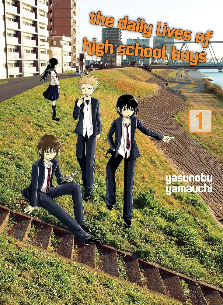
The front covers of “The Daily Lives Of High School Boys” are very unusual as they have real life photos of Japan with the characters drawn to somewhat fit the environment, however they look slightly out of place. They just look photoshopped in but I think charming and a unique way of doing a manga cover.
However, the real issue is that the typography on this doesn’t match the theme at all and is very lacklustre. The colour doesn’t make it stand out and the font isn’t very interesting. In addition, the placement of the lettering doesn’t feel right and the title looks awkwardly wonky. This could have been done on purpose with the idea that it could be seen as messy like most high school boys are but it doesn’t really translate well on the book cover. The volume number and author name look randomly placed aswell which looks unprofessional.
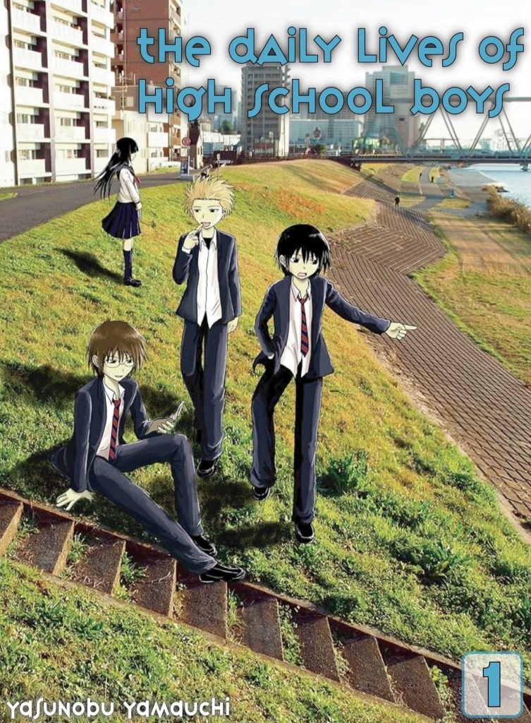
Firstly, to create my “reworked” cover I took the original and erased the all the typography with Adobe Lightroom using the magic eraser which left me just the artwork. I then added shadows to all the characters to make them feel less photoshopped in and to create realsim. Next, I changed the typography and the placement of the words, for the font I chose Variex OT as I felt it matched the theme with the interesting and unorganised look, similar to some high schoolers. The reason I chose blue is because stereotypically boys are associated with the colour blue and matches the subdued colour palette. Finally, I organised the words to fit the page to not look cluttered in 1 area like before. I am very pleased with the result.
Figure 1. Muneyuki, K. & Yusuke, N. (2022) Blue Lock 1. Kodansha USA Publishing. https://bluelock.fandom.com/wiki/Blue_Lock_(Manga)?file=US_Volume_1.png [Accessed 28 Sept 2024]
?file=US_Volume_1.png)
Figure 2. Yasunobu, Y. (2020) The Daily Lives of High School Boys, volume 1. Vertical; Tie In edition. https://www.amazon.co.uk/Daily-Lives-High-School-Boys/dp/1949980219 [Accessed 30 Sept 2024]