To begin the website design process for Fresh, I started by exploring how the brand’s visual identity and personality could be translated into a functional and engaging digital experience. The aim of the homepage was to clearly communicate Fresh as a refreshing, playful, and eco-friendly flavoured sparkling water brand, while remaining intuitive and user focused.
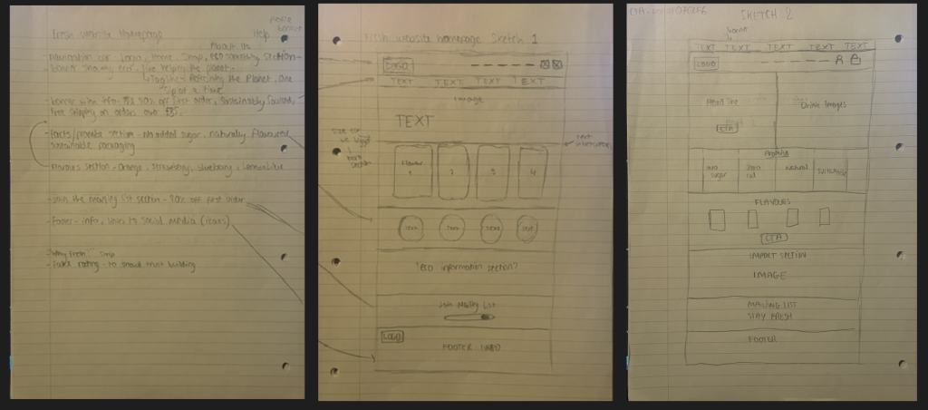
The wire framing process began with pencil sketches, allowing me to quickly explore ideas and test web structures. I created two different homepage layout concepts, each experimenting with how content could be structured while maintaining consistency with the Fresh brand identity. These early sketches focused on hierarchy, spacing, and user flow, helping me visualise how users would navigate the site and where key content should be placed.
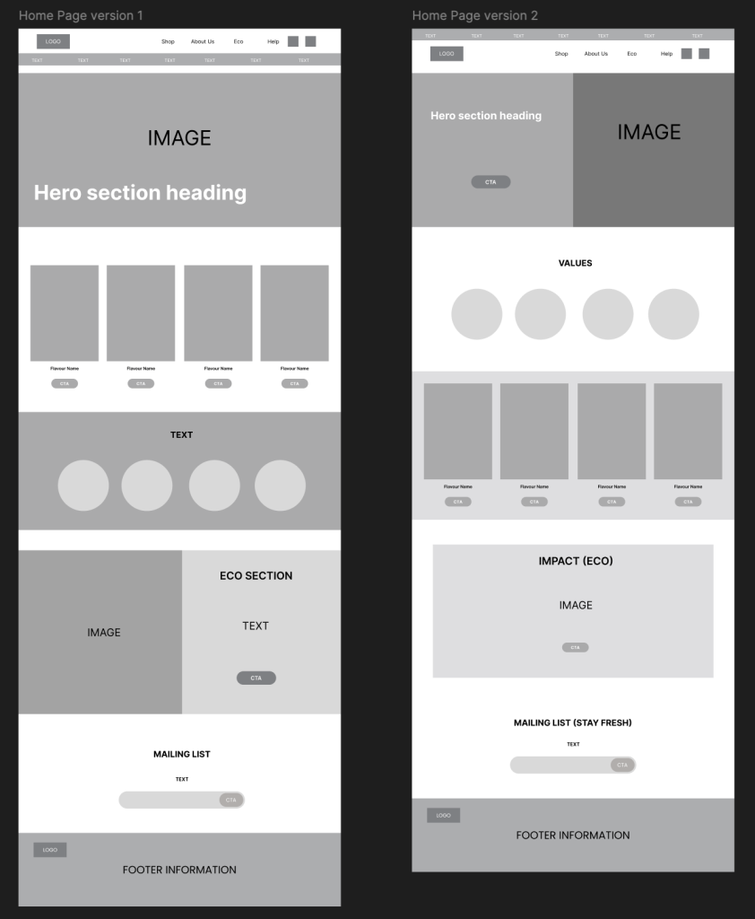
From these sketches, I moved into low-fidelity wireframes using Figma. This stage allowed me to develop the strongest layout further by clearly defining sections, contrast, and placement of elements. The low-fidelity approach ensured that decisions were driven by usability and structure rather than colour or detailed visuals at this stage.
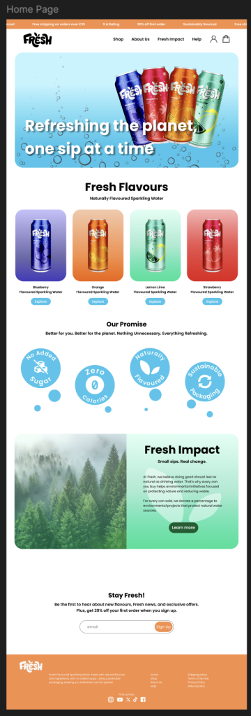
The main navigation bar was designed to include essential sections such as Shop, About Us, Fresh Impact, Help, and Profile/Basket, ensuring ease of access and a familiar experience, and I decided the black version of the Fresh logo would work well here as it contrasts well against the white background. The hero section was positioned at the top of the page and designed to immediately showcase the Fresh cans and their four flavours. This section also includes the brand tagline, “Refreshing the Planet, One Sip at a Time,” reinforcing both the product benefit and the sustainability message.
Additionally, above the navigation bar, I included a carousel banner to highlight key promotional messages such as 20% off first order, Sustainably sourced, and Free shipping on orders over £35. This feature supports the brand’s energetic personality while drawing attention to customer incentives and I chose to use the orange brand colour to give it high visibility.
A dedicated Flavours section was placed under the hero section, showcasing each product with accompanying call to action buttons to encourage exploration and purchases. This leads into the Values and Promise section, where Fresh’s core benefits like no added sugar, zero calories, naturally flavoured, and sustainable packaging are presented using bubble style visuals. This design choice reinforces the playful and refreshing nature of the brand.
An important part of the homepage is the “Fresh Impact” eco section, which explains how Fresh supports the environment. This includes information about sustainable practices and how a percentage of every can sold is donated to environmental initiatives that protect natural water sources and reduce waste. This section ensures that sustainability is clearly embedded into the brand experience rather than feeling like an afterthought.
To build brand loyalty, I included a “Stay Fresh” mailing list sign-up, offering users 20% off their first order in exchange for joining. Finally, the footer provides additional information and links to social media platforms where Fresh could actively engage with its audience.
Overall, the final wireframe layout successfully balances usability, branding, and storytelling. By following the established branding guidelines and maintaining consistency throughout, the homepage reflects Fresh’s exciting, youthful, and eco-conscious personality, creating a strong foundation and could definitely be developed further.
Figma Link: