Before beginning the wireframe development for the Fresh website homepage, I created a set of branding guidelines to ensure that all visual elements remained consistent, cohesive, and aligned with the brand’s personality. These guidelines acted as a foundation for translating the Fresh brand into a digital experience, helping to clearly communicate its values of excitement, sustainability, and refreshment while appealing to a youthful, eco conscious audience.
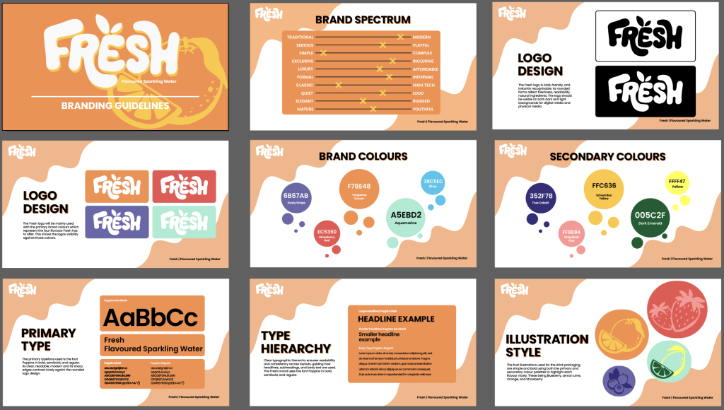
One of the key elements within the branding guidelines is the brand spectrum, which establishes how Fresh should look and feel. This includes clear rules for logo usage, colour application, typography, and supporting visual elements. The Fresh logo is presented in both black and white versions to demonstrate its flexibility and legibility on light and dark backgrounds. This ensures that the logo remains recognisable and effective regardless of context, whether it appears on a website, advertisement, or packaging. Additionally, the logo is shown against the chosen brand colours to demonstrate how it integrates naturally within the wider visual identity.
Colour plays a major role in expressing the Fresh brand’s playful and energetic personality. The primary brand colours consist of bold shades of orange, purple, red, and green, each representing one of the four drink flavours. These colours are intentionally vibrant to communicate freshness, fun, and summer energy, while still feeling modern and clean. Alongside these, blue is used as a call to action colour, appearing on interactive elements such as buttons within advertisements and the website. This helps important actions stand out clearly and guides users through the digital experience.
To add depth and variety to the visual system, a set of secondary colours has also been introduced. These include slightly darker or lighter shades of the primary palette, such as dark purple, pink, yellow, and dark green. These secondary colours are primarily used within illustrations and artwork created for the can designs and digital visuals. By using variations of the main colour palette, the brand maintains visual consistency while avoiding repetition and flatness.
Typography is another crucial part of the Fresh branding guidelines. The Poppins typeface was selected as the brand’s main font for both advertising and website use. Poppins works particularly well because its clean, geometric structure and sharper edges contrast effectively with the bubbly, organic logo design. This balance ensures that body text and headings remain clear, readable, and accessible, while still fitting comfortably within the brand’s energetic and youthful tone.
Together, these branding guidelines provided a clear framework for designing the Fresh website homepage. By establishing consistent rules for colour, typography, and logo usage, I was able to approach the wire framing stage with confidence, ensuring that the final digital layout would accurately reflect the Fresh brand identity and personality.