The initial design stage of this project focused on exploring three distinct branding briefs. Eco Future, an eco-friendly sustainable company, Cab-E Online, a local taxi firm aiming to dominate the digital space, and Influence Hull, a business consultancy group based in Hull. The purpose of this phase was to investigate different visual styles, tones, and brand personalities through research and mood board development, before selecting one direction to take forward.
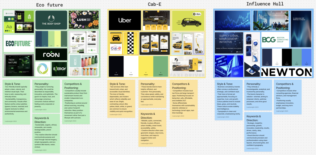
For Eco Future, research into existing eco friendly brands highlighted a consistent visual language. Many sustainable brands adopt clean, minimal, and natural aesthetics, often using colours such as greens, browns, soft neutrals, and muted blues. The tone is typically ethically driven, transparent, and optimistic, reflecting values of sustainability, responsibility, and innovation. Competitors in this space often focus on trust, environmental impact, and lifestyle improvement, with brand personalities that feel calm, forward thinking, and purpose led.
In contrast, the Cab-E Online taxi brand mood board explored a more functional and urban design approach. Taxi and transport brands commonly use bold typography, high contrast colour palettes (often yellows, blacks, or blues), and clear iconography to communicate speed, reliability, and accessibility. Competitors in this space prioritise usability and clarity, with brand personalities that are efficient, dependable, and tech driven, rather than emotionally expressive.
The Influence Hull business consultancy mood board reflected a more corporate and professional tone. Consultancy brands typically use neutral colour palettes, structured layouts, and refined typography to convey credibility and expertise. The visual style is often minimal and polished, targeting professionals and organisations. Brand personalities in this sector tend to be confident, strategic, and authoritative, focusing on trust and long term value.
After exploring all three directions, I chose to continue with the eco friendly brief, as it offered the greatest opportunity for creativity and emotional engagement. This led to the development of my own sustainable flavoured sparkling water brand, Fresh.
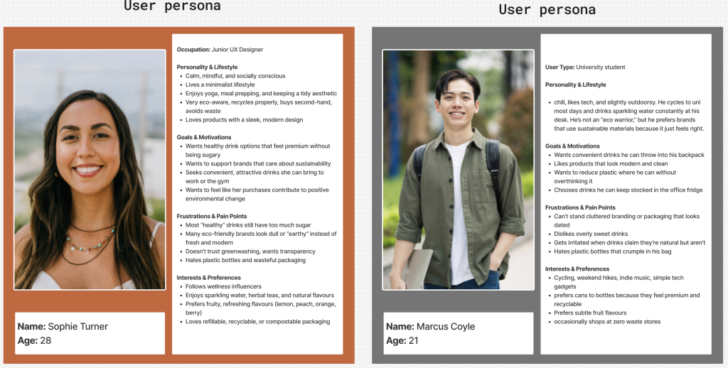
To support this direction, I created key brand strategy elements. Two user personas were developed, both representing eco conscious individuals aged approximately 16-35 who value health, sustainability, and making better choices for themselves and the planet. These personas helped define user motivations, lifestyle habits, and expectations from an eco-friendly product.
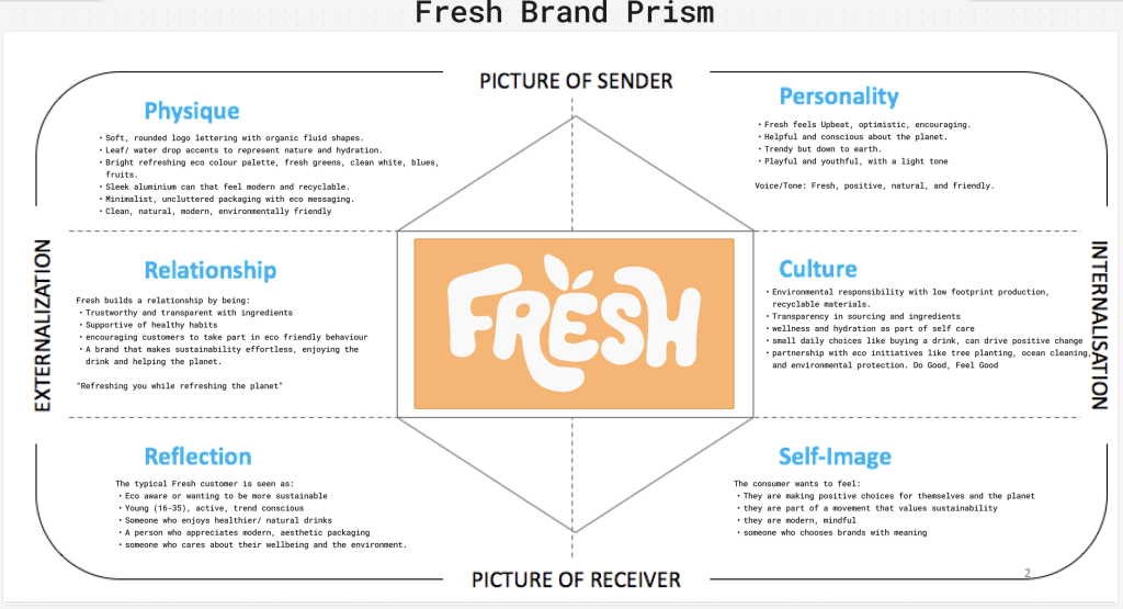
A brand prism was also created to clearly define Fresh’s identity. The physique focuses on vibrant flavours and clean design, while the personality is energetic and exciting. The culture centres on sustainability and health, with a friendly relationship built on trust and positivity. Reflection and self-image position the consumer as active, modern, and environmentally aware.
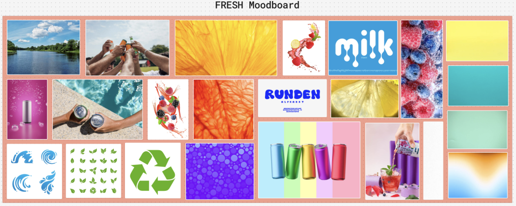
The mood board for Fresh reflects a brighter, more playful take on eco branding. It features bold, summery colours, eco inspired illustrations such as leaves and water droplets, fruit imagery, water splash visuals, recycling symbols, and bubbly typefaces. This approach helps Fresh stand out from more muted eco brands while still maintaining sustainable values.
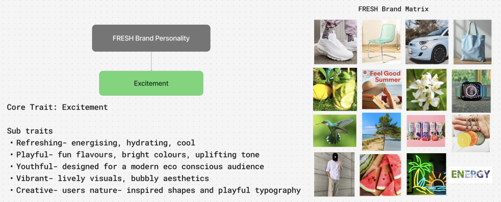
Finally, the brand personality was defined with Excitement as the core trait, supported by refreshing, playful, youthful, vibrant, and creative characteristics. The brand matrix further reinforced this identity by visualising Fresh as energetic, modern, and eco conscious across different formats, from an electric car and fitness watch to a summer playlist, beach setting, and the word that best describes the brand being energy!
Together, these elements formed a strong foundation for the Fresh brand direction and guided all further design development.
Figjam Board Link: