As I moved towards finalising my mid-fidelity prototype, I gathered feedback from peers and tutors to refine the design and improve the user experience. This stage helped me think more critically and responsibly about the impact of my decisions, both ethically and sustainably. In this post, I will reflect on the changes I made based on feedback and explain how my design approach aligns with inclusive, ethical, and sustainable UX principles.
Implementing User Feedback
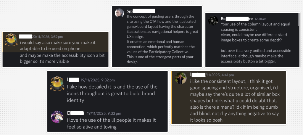
One of the most consistent pieces of feedback I received was that my use of a 12-column grid and equal spacing created a clean and consistent layout. However, a few users mentioned that the design could benefit from more depth and variation, especially within content-heavy sections. I responded to this by adjusting the Projects and So What? Blog pages, incorporating larger featured post cards alongside smaller ones. This variation helps create visual hierarchy and makes the page feel more dynamic without overwhelming the user. Another key point raised was the role of the illustrations and icons. Users felt that they were highly effective at guiding the user through the site, especially the illustrated game-board on the Our Story page, which was described as a great UX method for storytelling. This reinforced my decision to use the illustrations consistently as narrative aids.
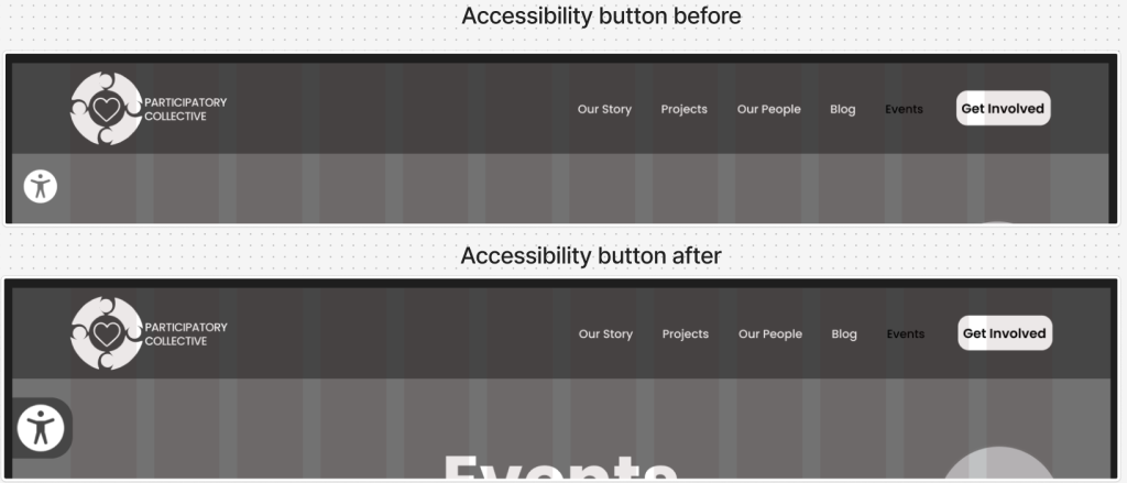
Some feedback also highlighted that the Accessibility button could be slightly larger to increase visibility. In response, I adjusted its size and ensured it had sufficient contrast, making it easier for users to locate without straining. Another bit of feedback I got was about importing work from illustrator into figma, originally I used screenshots and they weren’t very good quality but then I got advice to import them as an svg and this made the quality a lot better, making the designs not pixelated and professional. Finally, users mentioned mobile responsiveness. While my mid-fidelity focuses on the desktop experience, multiple people suggested introducing a burger menu for smaller screens to prevent the navigation from feeling cramped. I plan to implement this in the high-fidelity prototype to maintain clarity and avoid squeezing elements into a limited space. Overall, the feedback was constructive and positive, and it has directly improved both the accessibility and usability of my design.
Thinking Responsibly as a Designer
A major part of this assignment was demonstrating responsible design thinking. I focused on ensuring the site felt inclusive, equitable, transparent, and sustainable.
Reducing Unnecessary Content Load
One way I addressed sustainability was by prioritising quality over quantity. Instead of overloading pages with images or long blocks of text, I kept content meaningful and intentional. For example, on the So What? Blog page, post descriptions and CTAs only appear on hover. This not only helps maintain a clean layout but also reduces visual noise and lightens the content load, supporting faster loading times and lowering the site’s carbon footprint.
Meaningful Representation of People & Communities
The people and communities represented in my design are integrated in a genuine and meaningful way. Rather than using illustrations decoratively, they serve UI and narrative functions by guiding, supporting, and orienting the user throughout the site. This reinforces the Collective’s relational values without reducing communities to simplistic symbols.
Inclusive Language
I also ensured that all language across the site avoids gendered terms and remains neutral, open, and welcoming. This was important to me because inclusive language supports a wider range of users and aligns with the Participatory Collective’s values of equity and care.
Accessibility Considerations
Accessibility was integrated from the start. My hierarchy uses bold titles, semi-bold subtitles, and readable body text with the Poppins typeface, which is highly legible. Buttons are large, have sufficient contrast, and include clear and welcoming labels. Users with visual impairments can also access the accessibility settings through the Accessibility button, where functions like alt text, text resizing, and contrast options have been included.
Future Improvements & Reflections
Although I did not incorporate dark mode into the mid-fidelity stage, I plan to explore it in high fidelity to improve accessibility for light-sensitive users. I will also refine mobile layouts based on the feedback regarding navigation and spacing. This final stage of the process has shown me the importance of reflective iteration. The feedback I received has strengthened the design, making it more accessible, more ethically grounded, and more meaningful for all user groups. By considering sustainability, representation, language, and accessibility, I feel confident that my design supports the Participatory Collective’s mission in a thoughtful and responsible way.