To start off with, I decided to try the Crazy 8s exercise to help brainstorm some ideas for the low fidelity UI prototype. I found this extremely helpful as coming up with ideas can be difficult this exercise made it easier to make something even if you have no ideas; so I just started drawing and came up with 8 different designs, which ultimately all combined to becoming the foundation for my actual low fidelity prototype.
After creating some of these designs in Figma, these were some that I eventually improved upon:
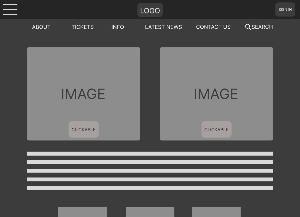
Whilst the design isn’t bad, I felt there are some notable problems that could effect user experience:
- It’s not cluttered but has too much information for a homepage, this can lead to users feeling overwhelmed when opening the site.
- The clickable buttons aren’t clear enough against the images, this lack of contrast could lead to accessibility issues.
Additionally, I changed the ‘about’ page on the homepage to ‘program’ to help give it a clearer identity against ‘info’.
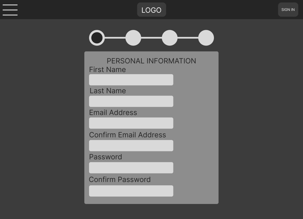
The second design was rejected due to poor layout. The password option was useless due to not needing to put one in the payment process, only the email is required, however this option would be useful in the ‘sign in’ process. Additionally, the personal information step in the payment process later became the second step.
References: