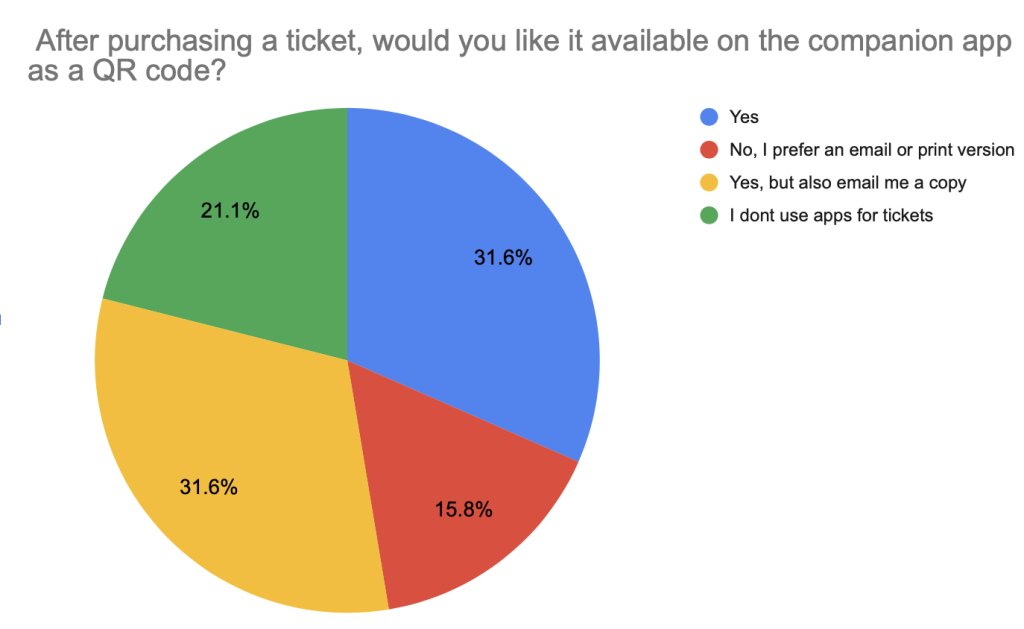
This blog post focuses on the development of my gaming festival companion app, progressing from low-fidelity to mid-fidelity. With the help of user feedback, improvements have been made on the User Interface (UI) and User Experience (UX). These changes and additions will hopefully refine the overall design of the companion app and the way it flows.
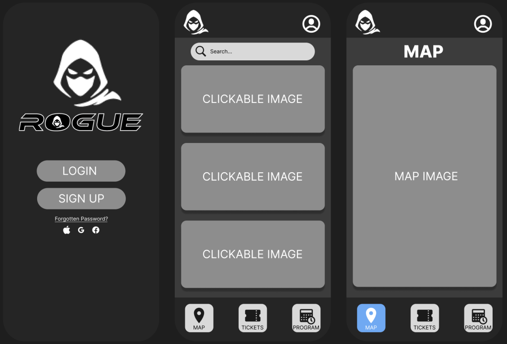
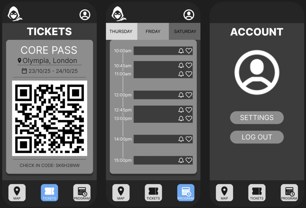
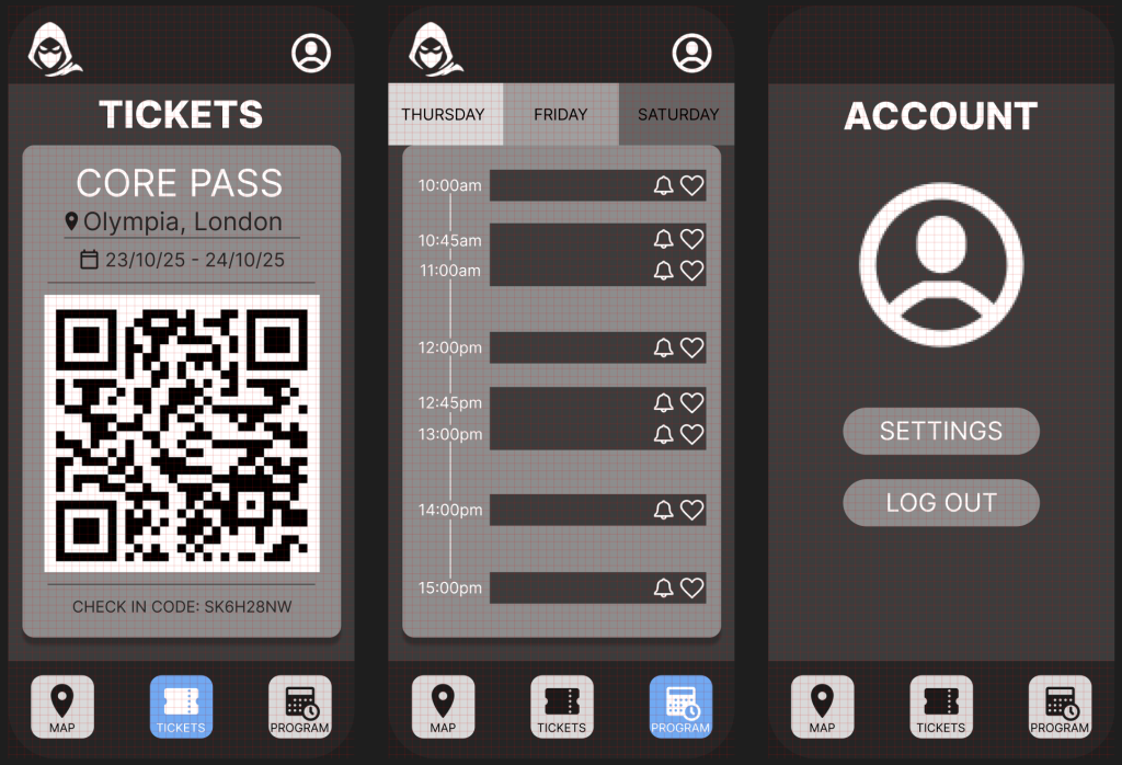
The companion app for the Rogue gaming convention was designed with a clean, minimal layout to ensure ease of use and quick access to key features. It opens with a login/ sign-up page, allowing users to securely access their personal ticket and event information. The main menu keeps things simple, offering just three navigation options at the bottom: Map, Tickets, and Program- mirroring the structure of the website for consistency. The Tickets page is detailed and user-friendly, clearly displaying the type of ticket, the date it’s valid for, and the event location. To enhance usability, the active page is always highlighted with a colour change in the navigation bar, so users know exactly where they are within the app.
Furthermore, the Program page features a clear and organised event schedule, with helpful interactive features like a bell icon to set reminders for specific events and a heart icon to favourite them for easy access later. The Account section includes settings and allows users to log out at any time, ensuring everything remains accessible and under user control. Overall, the app prioritises clarity and ease, making it a seamless tool for navigating the festival experience.
Additionally, during the process of developing the design from low-fidelity to mid-fidelity, the decision to remove the dropdown menu was made. This was due to too many options being overlooked and adding additional pages that could obscure essential actions and lead to disengagement from users. Talajiya (2022) states, people tend to be overwhelmed if faced with too much information at once. Minimising product options helps users avoid choice overload and makes desired actions intuitive.
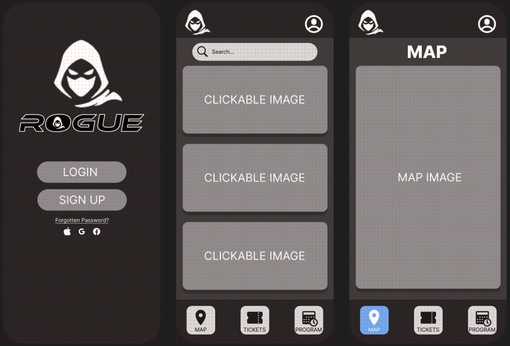
When designing the companion app, I used a grid layout to ensure consistent structure and equal spacing across all pages. The grid system acted as a framework that guided the placement of elements like buttons, text, and images, helping everything feel balanced and aligned. This approach not only made the design process more efficient but also contributed to the cleaner, more professional look.
References:
Talajiya, R. (2022) The Allure and Impact of Minimalist UX Design. Available Online: https://www.toptal.com/designers/ux/minimalist-ux-design-strategies [Accessed 7/4/2025].