This blog post focuses on the development of my gaming festival website, progressing from low-fidelity to mid-fidelity. With the help of user feedback, improvements have been made on the User Interface (UI) and User Experience (UX). These changes will hopefully refine the overall design of the website and the way it flows. Additionally, while creating this mid-fidelity prototype, I have structured it around the user journey maps created in earlier blog posts.
To get high amounts of user feedback, Zivkovic (2025) states that close-ended questions are amazing for quantitative feedback as it’s easy to measure the results and even easier to analyse data. With that in mind, a 5 close-ended questionnaire was sent out to see what was needed to improve the website.
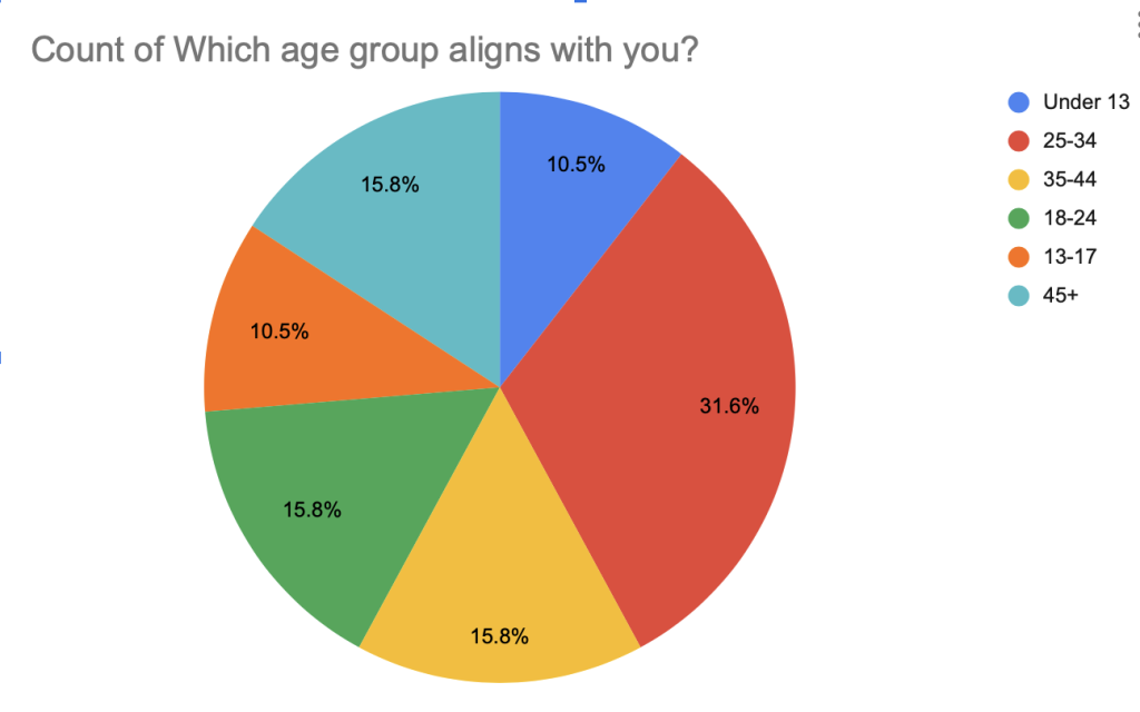
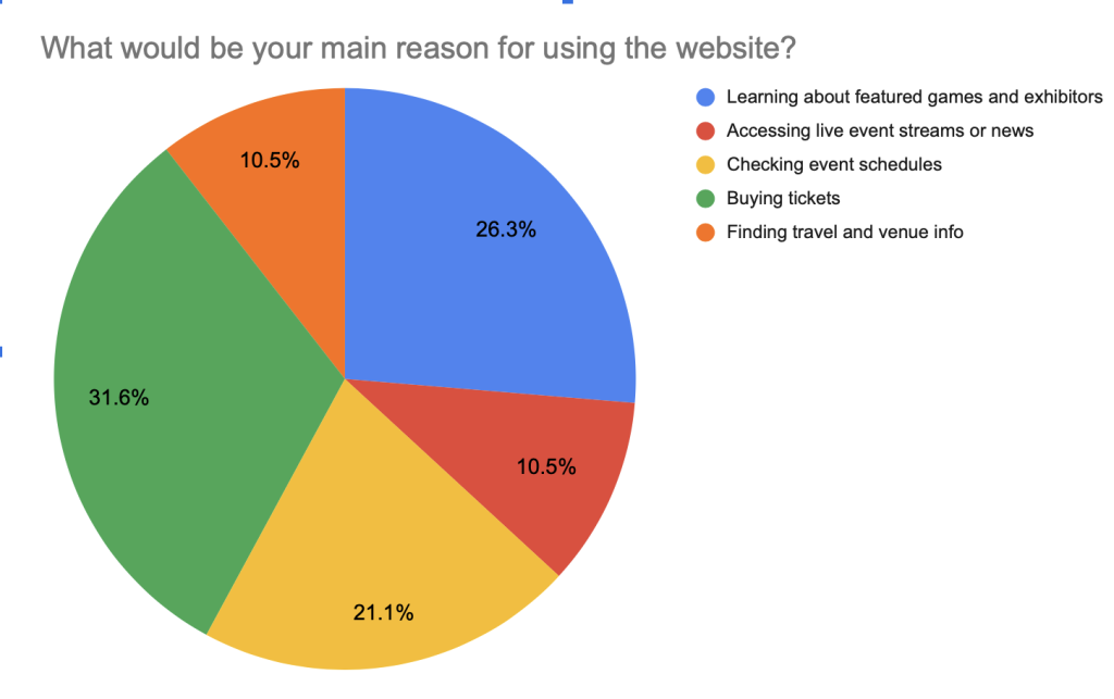
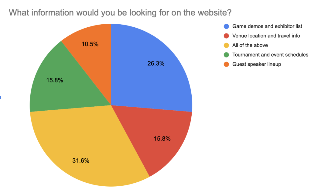
Based on the data collected from the close-ended questions shown above, this highlighted what age group was most likely to use the website and attend the festival, along with what users goals were when accessing the website. This data helped with deciding what should be kept on the website, what wasn’t needed, and what needed to be included. After gathering user feedback, several refinements were made to the website’s interface, including reducing the number of options on the home page for easier navigation, adding more detailed content to key pages, and improving button cues for clearer user direction.
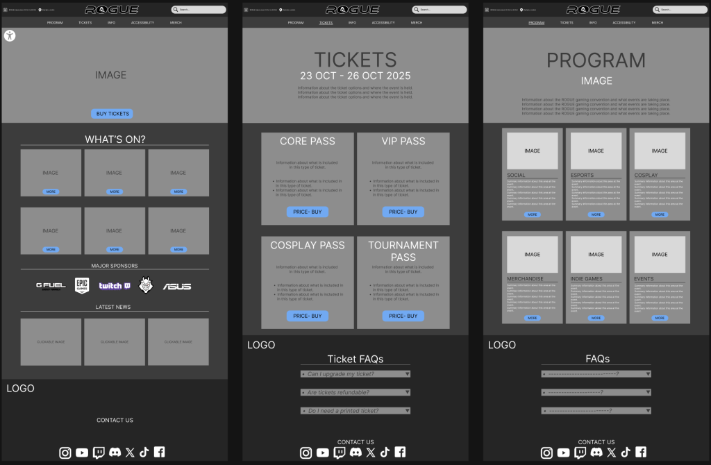
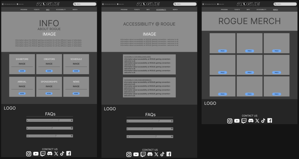
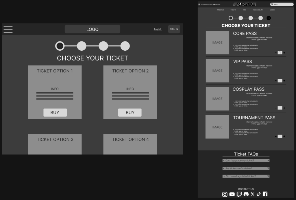
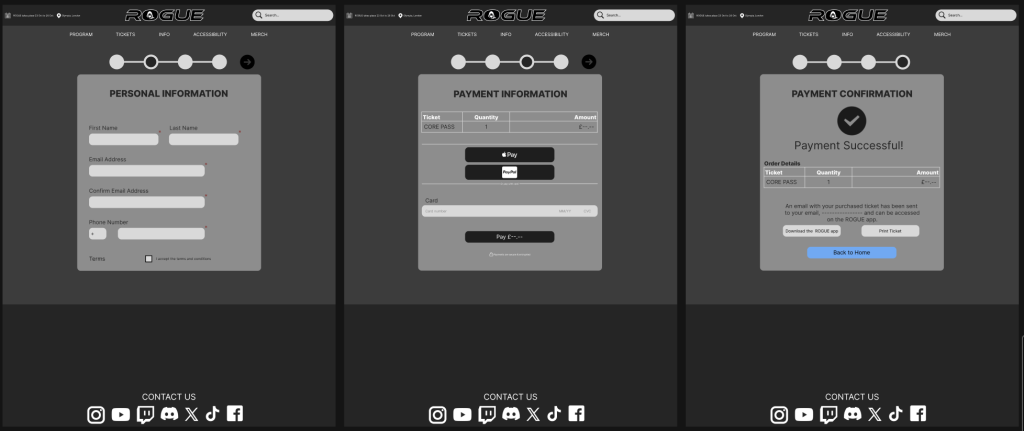
These Mid-fidelity designs were created with the user feedback in mind and reflect these refinements clearly. Since buying tickets was identified as the main reason users visited the site, buy tickets button was placed front and centre on the homepage to make it as accessible as possible. The other main pages (program, tickets, info, accessibility, and merch) have been expanded with more detailed content. The search bar has also been redesigned for a cleaner look and improved usability. Additionally, the sign-in button and dropdown menu were removed; the dropdown menu in particular was cut due to too many options being tucked away and overlooked, Söderland (2025) states drop-downs are generally a poor choice for offering fewer than 5 or more than 10 options. Instead, important information is now placed directly on the homepage, with FAQs added to each main section for quicker answers and a smoother experience overall.
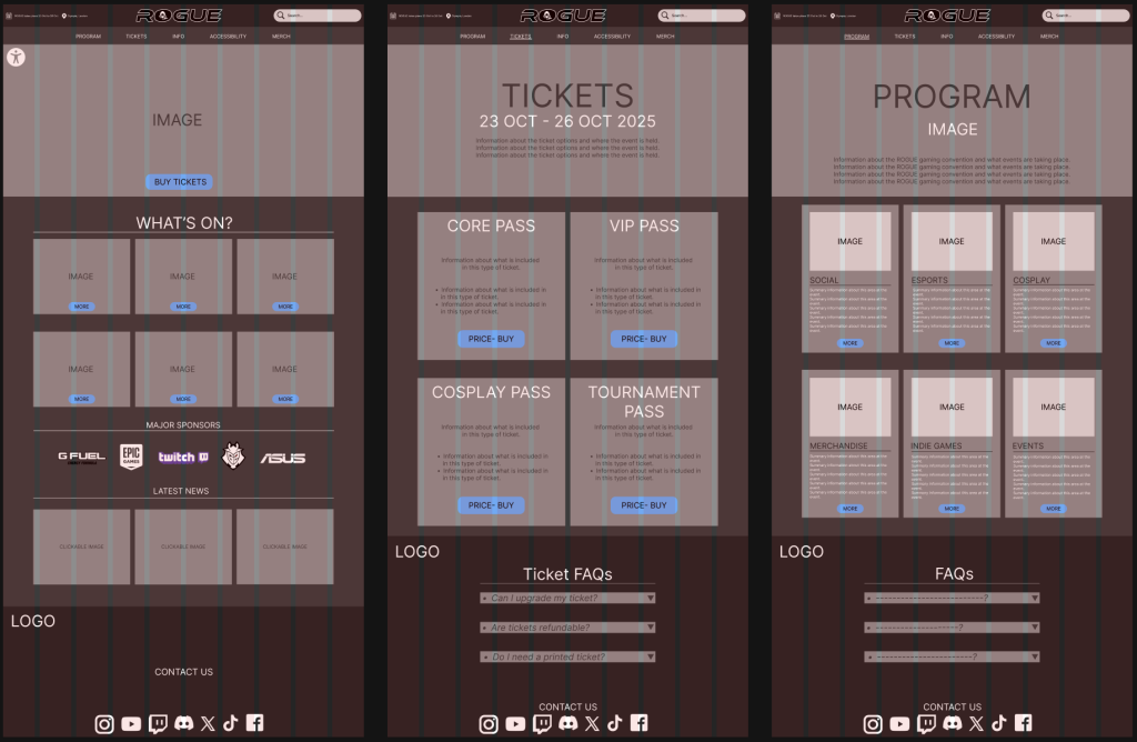
While creating the design, I used grids and columns throughout the layout to keep everything aligned and visually coordinated. This structure helped maintain consistency across pages and ensured content was in the right place. I also made sure to incorporate margins to create white space to give each element room to breathe, preventing the pages from feeling overcrowded or overwhelming to the user, creating a cleaner, more user-friendly experience. Nikola (2023) states the structure, balance, and flexibility that grids provide unlock the potential for creating impactful and visually stunning websites.
References:
Zivkovic, M. (2025) Closed-Ended Questions: The Ultimate Guide (+Examples). Available Online: https://survicate.com/blog/closed-ended-survey-questions/ [Accessed 2/4/2025].
Söderland, L. (2025) Drop-Down Usability: When You Should (and Shouldn’t) Use Them. Available Online: https://baymard.com/blog/drop-down-usability [Accessed 3/5/2025].
Nikola (2023) The Importance Of Grids In Web Design: Complete Guide. Available Online: https://cliowebsites.com/the-importance-of-grids-in-web-design/ [Accessed 3/5/2025].