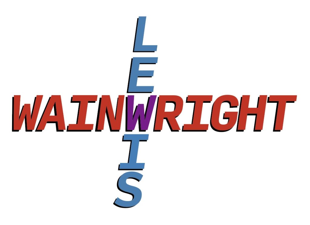
For my first typographical idea, I tried integrating both my first and last name. Since I have 3 Ws in my full name that was a great way of connecting them in some way. I noticed that if I used the W in my first and last name, I could create a cross with both. For the colours I chose red, blue and purple. The reason for this is because red and blue mixed together makes purple and fits perfectly with the idea that the blue on my first name and red on the last name intersect at the W which mix and make the W purple.
For the font I chose “Input mono” in bold italic. I liked how the font had really sharp straight edges. The letter “I” when it’s capitalised has a nice crossbar which makes the W in my first name sit nicely above it. It creates a compact feel and makes both my first and last name conjoined using the letters they have in common. Adding the drop shadow creates depth making the letters look less flat.
While thinking of ideas for another logo, I started experimenting with the pen tools on illustrator and found a way to warp text into a shape and this was the result. I was experimenting on the different shapes I could create with the curvature tool to create smooth bubble looking shapes. I liked the idea of giving bold text a sense of movement, making the design feel more alive like flowing water or like the name in the middle of my design looks like it’s squished or stretched. Furthermore, I made the shapes fit together to make the design flow like fluid.
Additionally, I find that repeating a piece of text is a good way at experimenting with colour and different fonts. Repetition can also create a pattern in the design, which can enhance visual interest and cohesion. The shades go from dark blue to light and even turquoise, creating a gradient effect. The font I chose for this design is “Montserrat Extra Bold Italic” and because the letters are bold it fit perfectly with my design. The boldness makes it very legible even when being warped into a shape.