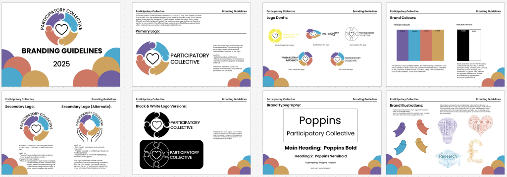
This stage builds on the branding guidelines developed in Assignment 1, refining and applying them consistently across web, mobile, and social platforms. The original brand system established a clear foundation, including primary and secondary logo variations, black and white alternatives, a defined colour palette, a chosen typeface, and a set of illustration elements based around the logo figures. These core elements were carried forward into the high-fidelity prototype to ensure consistency, recognition, and a strong visual identity for The Participatory Collective.
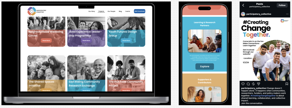
The brand was translated into the website in a way that reinforces clarity and storytelling. As discussed in the previous post, the colour palette and illustrations are used to guide users through the site and support navigation without relying on heavy text. The illustrated figures from the logo are used throughout the website as visual guides and page accents, helping to reinforce brand recognition while also adding warmth and personality. This approach allows the identity to feel present without overwhelming the content.
The logo system consists of one primary logo and two secondary variations. The primary logo places the circular symbol to the left with the organisation’s name set alongside it, making it ideal for headers and navigation. One secondary logo arches the name over the circular illustration, while the second adds supporting hands beneath the figures, further reinforcing themes of support, collaboration, and collectivity. These variations allow flexibility across different contexts while maintaining a cohesive identity.
Typography plays a key role in hierarchy and accessibility. The Poppins typeface is used in Bold, SemiBold, Medium, and Regular weights to clearly differentiate headings, subheadings, and body text. Poppins was chosen for its excellent readability and clean letterforms, while its sharper edges provide contrast against the soft, circular logo and illustrations.
The colour palette consists of teal, amber, plum, and coral, which represent the four key stakeholders and are used consistently to help users understand relationships without excessive explanation. Navy is introduced as an accent colour for call to actions, the footer, and page title illustrations, ensuring clarity and balance where information is not stakeholder specific.
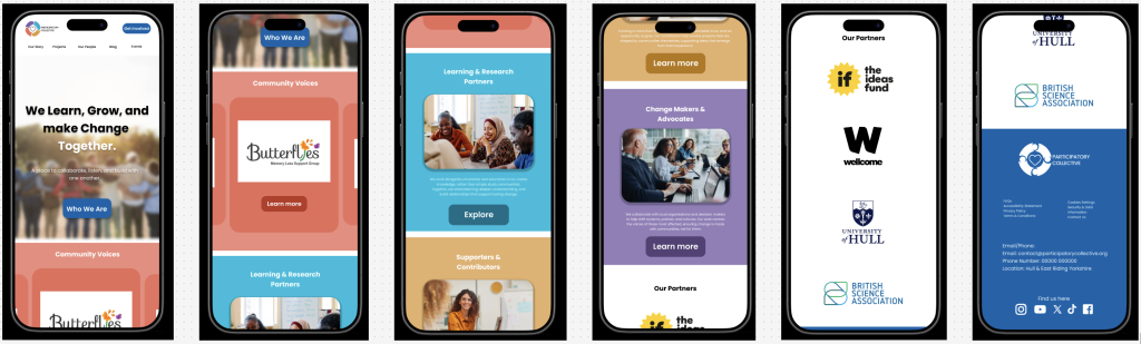
This identity translates effectively across platforms. The mobile homepage maintains the same tone and structure as desktop, with slightly larger visuals to support touch interaction. On social media, particularly Instagram, the branding remains consistent through colour, typography, and the use of the secondary badge logo, creating a welcoming and inclusive presence that aligns seamlessly with the website.
Figma Link (Mobile)