For the logo development stage of this project, my aim was to create a visual identity that clearly represents Fresh as an eco friendly, flavoured sparkling water brand while also reflecting its core brand personality of excitement. To achieve this, I explored existing drink brand logos to understand how bold typography, colour, and symbolism are used successfully within the soft drinks market.
Inspiration & Visual Research
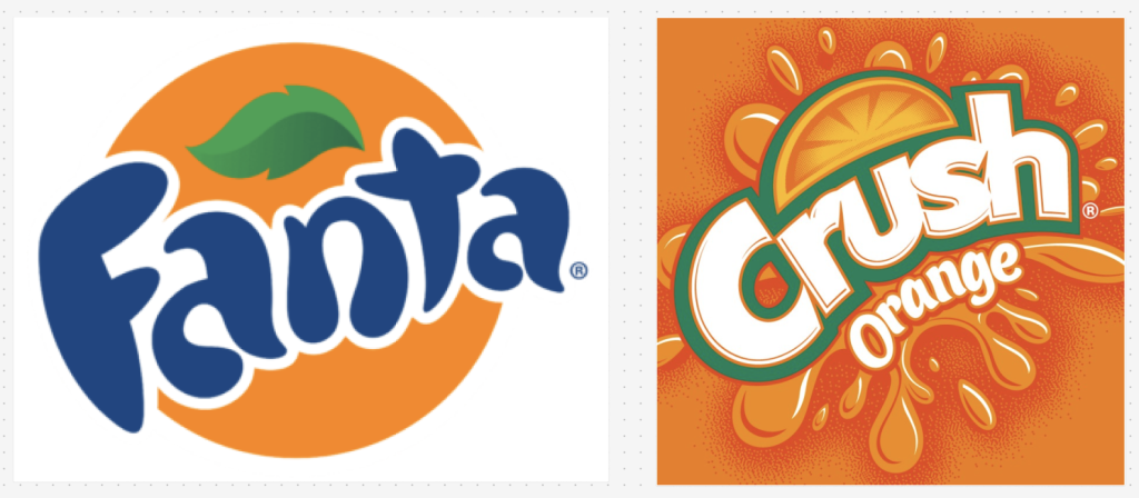
Before designing my own logos, I researched well-known beverage brands, focusing in particular on Fanta (especially its 2010–2016 logo era) and Crush. These logos stood out due to their use of bold, bubbly typography, dynamic shapes, and energetic compositions. The Fanta logo in particular influenced my work through its playful lettering, circular background elements, and subtle inclusion of a leaf, which links the brand back to fruit and freshness. Crush also inspired the use of vibrant colours and expressive letterforms that feel fun, youthful, and instantly recognisable.
From this research, I identified key visual themes I wanted to incorporate into my own designs. Rounded bubble style fonts, splash or circular backgrounds, bright colour palettes, and organic elements such as leaves and water shapes. These references helped guide the direction of my logo concepts while ensuring they still felt original and aligned with Fresh’s eco conscious image.
Early Sketches
Digital Refinements
I created three distinct logo options, each developed in both a digital and print version to ensure adaptability across platforms. Digital logos were created at 150px, 72dpi, RGB, while print versions were designed at 720px, 300dpi, CMYK.
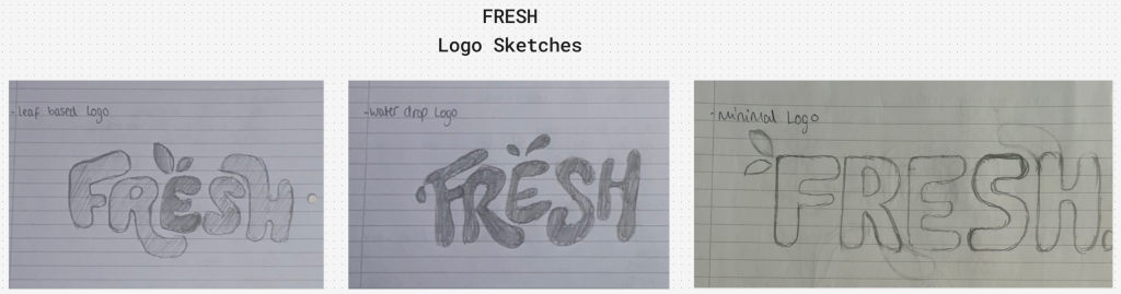
Logo One – Leaf Logo
The first logo features curvy, bubbly letterforms with two small leaves positioned above the “e” in Fresh. This design feels cohesive, smooth, and minimal while subtly reinforcing the eco friendly nature of the brand. The leaf detail symbolises sustainability and fruit origins without overpowering the logo. This version works particularly well at smaller sizes and feels balanced across digital and print formats, making it highly versatile. I have displayed this on the orange brand colour.
Logo Two – Water Drop Logo
The second logo builds on the same bubble typography but introduces a water splash and droplet effect. The letters appear more fluid and energetic, giving the logo a stronger sense of movement. Compared to the leaf logo, this version feels more dynamic and expressive, clearly communicating that Fresh is a drink brand. While slightly busier, it remains legible and visually engaging across different media. I have displayed this on the purple brand colour.
Logo Three – Minimal Logo
The third logo takes a more restrained approach. The word fresh is presented in a static, slightly more spaced out bubble font, accompanied by leaves placed beside the “F” to reference sustainability. A full stop is included to give the logo a more professional, health focused feel. While this design is clean and adaptable, it lacks the excitement and playful energy that defines the Fresh brand personality. I have displayed this on the red brand colour.
Reflection & Final Choice
After reviewing all three options, I chose Logo One (the leaf logo) as the final brand mark. It best represents Fresh’s identity by balancing eco-friendly values with a youthful, refreshing tone. The logo is adaptable, visually clear at multiple scales, and aligns strongly with the brand’s personality of excitement while still feeling clean, modern, and sustainable.
References
Logos World (2025) Fanta Logo, symbol, meaning, history, PNG, brand Available online: https://logos-world.net/fanta-logo/ [Accessed 29/12/25].
Logos World (2025) Crush Logo, symbol, meaning, history, PNG, brand Available online: https://logos-world.net/crush-logo/ [Accessed 29/12/25].