After completing my initial wireframes and sketches, the next stage of my process was developing my mid-fidelity prototype for the Participatory Collective website. This phase allowed me to refine my layouts, integrate my branding ideas more clearly, and begin establishing the UX patterns that will eventually define the high-fidelity version.
My overall aim for the mid-fidelity was to design a website that felt warm, human, and hopeful, reflecting the values of the Participatory Collective being unity, trust, and collaboration. Their work is grounded in people coming together, so my visual language needed to communicate this. The logo itself symbolises this idea, a circle of learning and participation, representing the four key stakeholder groups, academics, community groups, funders, and policy makers. In the mid-fidelity prototype, I wanted the identity to feel cohesive and intuitive, guiding the user gently through each page.
Building a Clear, Accessible, Visual System
One of the main developments from my wireframes to the mid-fi prototype was implementing my chosen typeface ‘Poppins’. I used varying font weights to establish a strong sense of hierarchy and ensure high readability. The Poppins font supports clarity and accessibility, which is essential for a community focused organisation.
I also refined all CTAs, ensuring they were consistent, functional, and clearly placed. Buttons such as “Who We Are,” “Get Involved,” and “Join Our Mailing List” were positioned to guide users through the experience without overwhelming them. Every CTA serves a specific purpose and contributes to the site’s storytelling strategy.
To support navigation and create a cohesive identity, I incorporated my character illustrations into the layouts. These illustrations act as narrative guides, leading users through the content in a gentle and engaging way. They visually echo the Collective’s belief in people-centred work and shared journeys. Their presence across multiple pages creates familiarity and warmth, along with reinforcing the brand identity.
Layout Structure & Accessibility
All pages were built using a 12-column layout grid, which helped keep the structure consistent, aligned, and easy to navigate. This grid system made spacing more precise, and I used enough whitespace to avoid overwhelming the user. Because many people who will use the website may not be familiar with complex digital platforms, maintaining a clean, breathable layout was essential.
The navigation bar has been fully implemented and includes all key pages needed for a smooth user journey. I made a deliberate choice not to include a burger menu, as hiding important information would go against the transparency and accessibility values of the Participatory Collective. Instead, the navigation bar stays fixed at the top of the page, meaning users can always find their way back to other areas of the site regardless of where they are.
At the bottom of every page, I also included contact details and social links. Keeping these elements consistent reinforces usability and ensures that important information is always accessible.
All Pages- Structure, Logic, and Storytelling
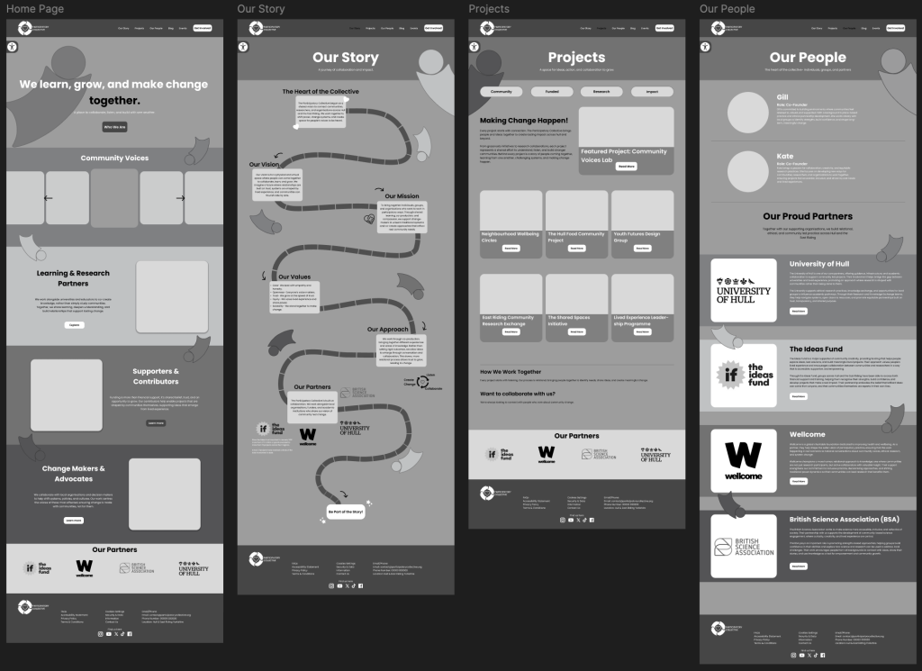
Homepage
The homepage has been designed to feel welcoming and representative of every stakeholder group. It opens with a large, bold message “We learn, grow, and make change, together.” The word together is highlighted to emphasise unity, a core message of the Collective. Below this, the page features a prominent CTA “Who We Are.” This button leads to the Our Story page and acts as the first step in the site’s storytelling flow. Character illustrations guide users down the page and introduce them to the four stakeholder groups. Community Voices, this section includes a carousel that will eventually contain images and descriptions of the community groups involved. Creating it as a carousel ensured fairness and equal visibility while also saving space. Then, Learning and Research Partners, this section introduces academic collaborators, including a CTA labelled “Explore.” Supporters and Contributors, this section explains the role of funders and includes a CTA “Learn More.” Change Makers and Advocates, this includes another “Learn More” CTA to keep the layout consistent. Beneath these groups is the Our Partners section, showcasing the organisations who work with the Collective to create real change. The combination of concise information, illustration, and clear structure makes the homepage feel both welcoming and informative.
Our Story Page
This page is designed as a game board / storyboard pathway, guiding the user through the Collective’s identity. Users follow a winding illustrated path supported by the brand’s characters, reinforcing the feeling of being guided through a journey. The path takes the user through, the Introduction, Our Vision, Our Mission, Our Values, Our Approach, and Our Partners.
The page ends with the CTA “Be a Part of the Story!” which leads users directly to the Events page. This supports the overarching narrative of inviting the user not just to learn, but to participate in creating change.
Projects Page
The Projects page presents community led, research based, funded, and impact driven projects. At the top, I included filter/category buttons representing the four stakeholder groups. This allows users to browse content relevant to their background or interests.
I also designed a Featured Project section at the top of the page to help highlight one project more prominently each week, creating visibility and encouraging engagement. Below that, all other projects are displayed with clean, consistent cards that include a “Read More” CTA. This page is structured to help users explore real examples of what participatory work produces in practice.
Our People Page
This page introduces the two co-founders of the Collective, Gill and Kate along with more information about the collectives partners. It will include their photos, short biographies, and character illustrations guiding the eye down the page. This human-centred approach makes the page feel authentic and personal. It shows the people behind the work and reinforces the Collective’s values.
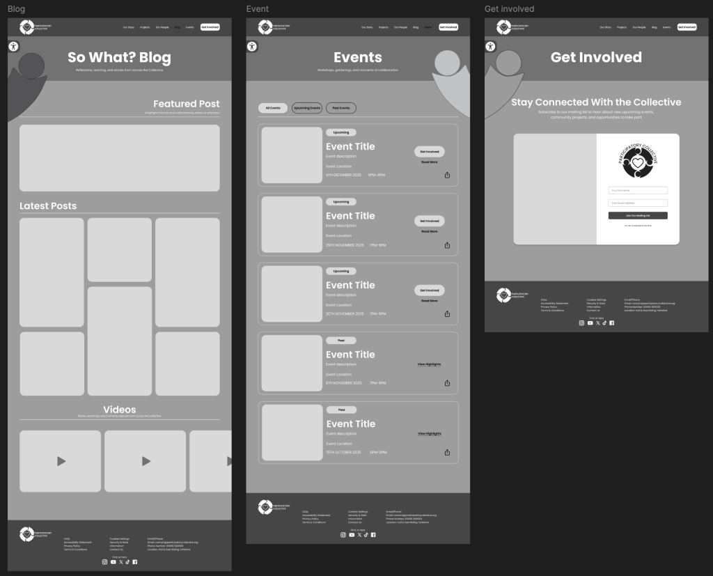
So What? Blog Page
This page is similar to the structure of the Projects page, starting with a Featured Post followed by a grid of Latest Posts and then a section for Videos. A key interaction in the mid-fidelity is the hover effect with text and CTAs only appearing when the user hovers over each post. This reduces visual clutter, helps focus attention, and keeps the layout clean. I also plan to add a share button so users can repost blog content across social media platforms, helping the Collective expand its digital reach.
Events Page
The Events page uses a clear filtering system with the options All Events, Upcoming Events, and Past Events. Upcoming events feature a strong CTA “Get Involved”, while past events show “View Highlights” as clickable text to create hierarchy without overwhelming the user with too many buttons.
Get Involved Page
Accessible from the navigation bar’s Get Involved CTA, this page contains a simple form where users can enter their name and email to join the mailing list. This allows people to stay informed about events and opportunities without having to constantly revisit the website.
Accessibility Implementation
I added the Accessibility button to the top left of every page with setting for users with visual impairments. Each page also includes a large illustrated character near the title to reinforce design consistency and visual identity for when colours will be implemented in the high-fidelity.
References:
Social Media Icons & Illustrations (except people illustrations) From Icons8
Icons8 (2025) Free Icons, Clipart Illustrations, Photos, and Music Available online: https://icons8.com [Accessed 23/11/25].
neon Brilliant Illustration (2025) British Science Association Available online: https://neonfutures.org.uk/submit-an-experience/british-science-association/ [Accessed 23/11/25].
The Ideas Fund (2023) The Ideas Fund | Home Available online: https://theideasfund.org [Accessed 23/11/25].
Wellcome (1936) Home | Wellcome Available online: https://wellcome.org [Accessed 23/11/25].
University Of Hull (1927) Unsame Old Story | University of Hull Available online: https://www.hull.ac.uk [Accessed 23/11/25].