When I began Assignment 2, I already had a strong foundation from Assignment 1, where I researched the Participatory Collective and explored their values, stakeholders, and participatory approach along with creating a strong brand identity. The Participatory Collective is a Hull-based movement that brings together Community groups, Academics, Funders, and Policy makers to shift power, co-create solutions, and support community led change.
For Assignment 2, my task was to create a mid-fidelity website for the Collective, focusing on accessibility, navigation, user-centred design, and visual storytelling. Before I could move into mid-fidelity, I needed to make my initial wireframes, starting with sketches and progressing into a refined low-fidelity prototype in Figma. This post documents that early stage of my process.
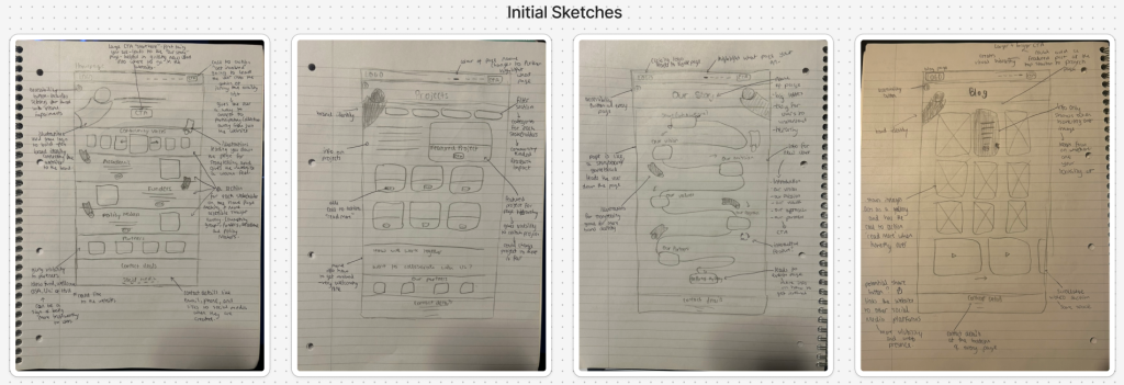
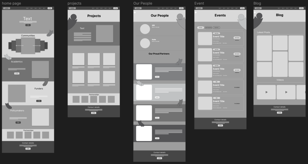
Home Page- Establishing Structure & User Flow
I began with sketches of the Home Page because it sets the tone for the whole site and establishes the user’s first impression. My layout is clean and structured, starting with a navigation bar across the top with clear paths to all main pages. Directly underneath, I designed a hero section featuring a call to action. Its purpose is to guide new users, especially those unfamiliar with the Collective, straight to the Our Story page. That page will explain who the Collective is, what they stand for, and how anyone can get involved. Many users may not understand participatory work at first glance, so I wanted a CTA that acts as a friendly introduction rather than pushing users toward something like signing up or joining.
Under the hero section, I included a section for each of the four stakeholder groups which are Community Groups, Academics, Funders, and Policy Makers, along with my figure illustrations which guide the user down the page which are going to be colour co-ordinated to each stakeholder. These groups shape the entire identity of the Participatory Collective, and they are also the foundation of my branding concept. Visually, this section helps users immediately recognise the breadth of people involved in the Collective’s work. Next, I designed a scrollable carousel for Community Groups, this carousel allows users to browse through the different communities involved in the Collective without flooding the page which multiple cards all at once. The rest of the homepage includes sections for Academics, Funders, Policy Makers, and finally an area for the Participatory Collective’s partners and contact details near the bottom having these make the website look more authentic and trustworthy to users since it has connections to other real sites.
Our Story Page- Storytelling Through a Game Board Style Layout
From the Home page’s CTA, users flow into the Our Story page, which I sketched as a vertical storyboard/game board path that guides the user down the page. The path moves through key information such as an introduction to what the Participatory Collective is, Our Vision, Our Mission, Our Values, Our Approach, Our Partners, and at the end of the path, I added a CTA. This leads users to the Events page, where they can get involved through events and view upcoming and past activities. This game board layout also allowed me to incorporate my figure illustrations from the logo. These illustrations follow the user down the path, helping to build brand identity and create a friendly, cohesive tone. They also support accessibility by guiding users visually through the narrative. Additionally, I included an Accessibility button at the top left of the page, which will appear on all pages. It will contain options for users with visual impairments, such as larger font sizes or higher contrast settings. Accessibility is a crucial part of the Collective’s values, so I planned for it from the earliest wireframes.
Projects Page- Filters, Categories, and Featured Content
For the Projects page, I designed a layout showcasing the different community-led initiatives and funded projects associated with the Collective. I would like to implement filtering options for Community, Research, Funded, and Impact. These filters will help users explore the projects most relevant to them. I also want to design a Featured Project section, giving visibility to a project of the week. This helps highlight community impact and keeps the site feeling fresh and active.
Our People Page- Founders & Partners
This page introduces the co-founders and partners of the Collective giving users a more personal insight into who is behind the collective along with boosting credibility, supported again by my brand illustrations to maintain cohesion and personality leading users down the page.
Events Page- Structured Around User Needs
The Events page uses three categories which is what I would like in the projects page and these include, All Events, Upcoming Events, and Past Events, making it so users can view the events more clearly. Upcoming events feature a clear CTA “Get Involved”. Past events display “View highlights” as clickable text rather than a button, giving hierarchy and drawing more attention to the upcoming opportunities while still having the option to view past events if interested.
Blog Page- The “So What? Blog”
The Blog page, that will be called “So What? Blog”, has a grid of latest posts and videos. The key interaction here is that text and CTA buttons only appear when the user hovers over a post image. This keeps the page visually clean and prevents it from becoming overcrowded with text, especially since blogs can accumulate many posts over time. Along with this, I would also like to add a share button giving users a way to spread posts giving the collective more visibility and web presence. This could also link to the social media pages connecting back to the website.
User Flow & Next Steps
Throughout these initial layouts, I focused on creating a smooth user flow that leads the user through the various pages and used the branding for the storytelling, guiding the users along the way while creating a warm and welcoming tone. These wireframes set the foundation for my mid-fidelity prototype, where I refined spacing, alignment, layout consistency, and interactive elements.