From the beginning of my design process for the Participatory Collective, I knew I wanted to create more than just a functional website, I wanted it to tell a story. Storytelling in design isn’t just about words or visuals, it’s about creating an experience that guides the user through a journey that reflects the project’s values of collaboration, inclusion, and shared purpose.
Building a Linear Story Through Design
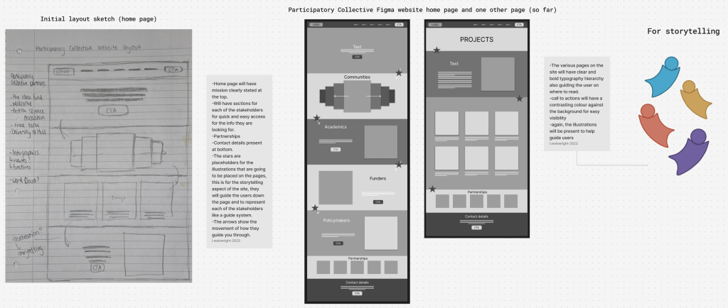
When designing my website in Figma, I focused on creating a linear story that users could follow naturally as they scroll. This sense of flow is shaped through colour, line, shape, contrast, and composition, each working together to guide the user’s eye and communicate meaning without words. “A good user experience takes the form of a story. The IA feels familiar and gives context and flow. The product itself will fit into a user’s sense of their own life story, and users are drawn to that.” (Mesibov, 2022)
-Colour: Straight way on the home page it shows the four stakeholder groups, using their assigned colour, golden amber (funders), teal (academics), coral (community members), and plum (policy makers). This creates a consistent rhythm throughout the site, allowing users to instantly recognise which section represents their perspective.
-Line and Shape: Rounded edges reflect the visual language of the logo, symbolising unity and connection. The illustrations from the logo lead the user’s down the page, almost like a continuous path through the story.
-Contrast: The use of light and dark contrast to highlight key calls to action and text areas, ensuring that important messages stand out clearly. This also helps users with visual impairments navigate the page with ease.
-Composition and White Space: Use of white space gives the content room to breathe. It avoids overwhelming the user and supports readability for people with cognitive differences or sensory sensitivities.
Every visual decision contributes to that sense of movement, helping users feel like they’re being guided through a story rather than simply browsing a website. By reusing the characters from the logo, the website visually ties back to the brand identity, reinforcing consistency and recognition. It also helps create a sense of warmth and movement, as if each stakeholder is part of a shared journey. Their curved shapes and flowing arrangement turn static branding into a living, interactive storytelling experience. Each colour maintains its stakeholder association, allowing visitors to intuitively understand which section they’re in, while the repetition of the illustrated figures creates a cohesive and memorable story.
Sketches to Wireframe
My initial hand-drawn sketches and low-fidelity wireframes mapped out the main journey through the website. The homepage begins with a clear mission statement, immediately communicating the Participatory Collective’s purpose. Below that, users encounter sections representing each stakeholder and then partnerships and contact details at the bottom. To support the storytelling aspect, the use of the illustrations based on the logo’s four figures, acting as a guide across the site, leading users from one section to another. These visuals not only reinforce the brand identity but also make the browsing experience more engaging and personal.
Inclusivity and Accessibility
A core part of the Participatory Collective’s mission is to be inclusive for all, and this extends directly into the design. When designing the layout, I considered users with both physical and mental disabilities, ensuring that everyone can engage comfortably. This includes high contrast between text and background for readability, clear visual hierarchy and typography to support users with dyslexia, consistent layout and spacing to reduce cognitive issues, illustrations that are friendly and recognisable without being overwhelming. The idea is that the site should feel welcoming and calm while being accessible in both appearance and tone.
Storytelling for All Demographics
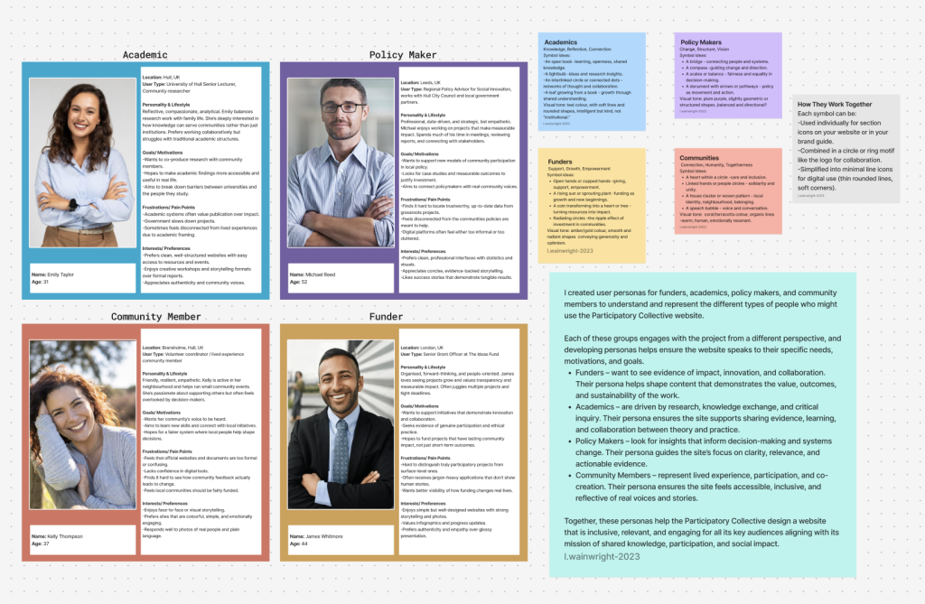
Storytelling in the Participatory Collective website is about relatability. Each stakeholder group has its own story, but all are connected by the same heart at the centre representing care and collaboration. Through colours, illustrations, and thoughtful wording, the site needs to speak to people from all backgrounds whether they’re academics exploring research, policy makers looking for evidence, funders seeking impact, community members wanting to share experiences, or newcomers interested in getting involved.
Ultimately, the Participatory Collective aims to bring people together, not just in research, but in understanding and shared progress. By using storytelling in design, the website becomes a living reflection of that mission. It helps users see how their role fits into the bigger picture, reminding them that change happens when we all connect.
Ethical Considerations in Storytelling Design
An important part of designing for the Participatory Collective is ensuring that the storytelling remains ethical and respectful. Ethical storytelling means representing all stakeholders fairly avoiding bias or stereotypes and designing spaces where people feel their voices are valued equally. It’s also about using design choices that don’t mislead or exclude users, and ensuring content can be experienced by people with different abilities, learning styles, and access needs. “Misleading or exaggerated storytelling cannot only erode trust but also create a disconnect between the brand and its users.” (Corvini, 2024)
Reflection
Working on the Participatory Collective website has taught me how powerful storytelling through design can be. It’s not just about making something look good, it’s about how design can guide emotion, build connection, and communicate purpose without using words alone. I’ve realised how small design choices like the curve of a line, the warmth of a colour, or the amount of white space can completely change how someone feels when they land on a page. Creating a sense of flow through visual storytelling helped me think about accessibility more as well. It reminded me that the design should feel human, inclusive, and welcoming to everyone, regardless of their background or ability.
References:
Marli, M. (2022) How To Use Storytelling In UX Available online: https://www.smashingmagazine.com/2022/04/use-storytelling-ux/?utm_source=chatgpt.com [Accessed 27/10/25].
Fabiana, C. (2024) Ethical Considerations in Storytelling in Product Design Available online: https://medium.com/design-bootcamp/ethical-considerations-in-storytelling-in-product-design-6cc7e9a00007 [Accessed 27/10/25].
Figjam Board: