When I first started developing the visual identity for the Participatory Collective, my main goal was to create something that visually expressed unity, trust, and collaboration. When you think of a collective or a community, the first thing that comes to mind is people coming together, connecting, supporting, and working side by side. I wanted the logo to capture that feeling of togetherness in a simple and symbolic way.

Logo Concept & Development
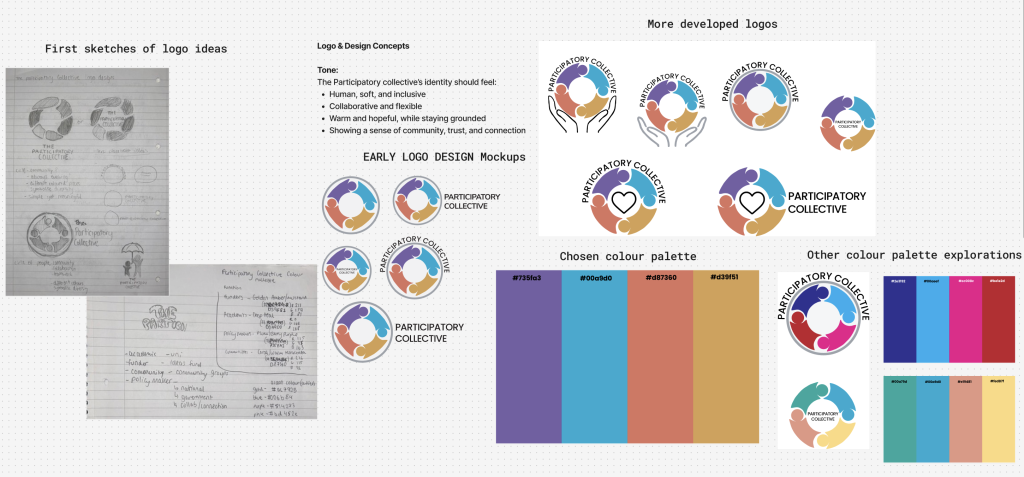
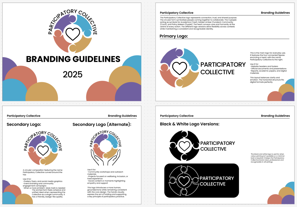
My early design thoughts centred around the idea of connection through people. To represent that visually, I chose to form a circle made up of four human-like figures linking together. The circular shape communicates teamwork and collaboration, suggesting that every voice and perspective has a place within the collective. Each of the four figures represents one of the key stakeholder groups involved in the Participatory Collective, Funders (Golden Amber), Academics (Teal Blue), Policy Makers (Plum Purple), and Community Members (Coral Red).
Using these four distinct colours not only helps differentiate the groups visually, but it also reflects the diversity and shared purpose that defines the Participatory Collective. The colours work harmoniously together, giving off a warm, optimistic tone while keeping a balance between professionalism and approachability.
Shape, Tone and Feeling
The circular form of the logo gives a sense of unity and inclusion, symbolising how all stakeholders are connected through shared goals. The smooth, rounded edges make the design feel friendly, human, and trustworthy, while the clean lines keep it modern and professional.
The heart shape in the centre represents compassion, empathy, and care, the emotional core of the Participatory Collective’s mission. The overall feeling is collaboration and positivity, and the balance of thickness and spacing ensures the logo feels confident without being overpowering.

Primary and Secondary Logos
I designed multiple versions of the logo to fit different contexts and applications. The primary logo, which is used for the website and digital platforms, places the circular symbol with the heart to the left, and the Participatory Collective text to the right. This layout feels balanced and works well for banners and headers. It’s clear, readable, and immediately recognisable. The secondary logos act more like badge-style variations. In these, the name is arched over the top of the symbol, with two different versions, one featuring the heart, and another with hands holding the circle. The hand variation reinforces the theme of care and human connection, making it especially effective for posters, or community campaigns. These variations help maintain consistency while offering flexibility across print and digital media.
Colour Palette and Meaning
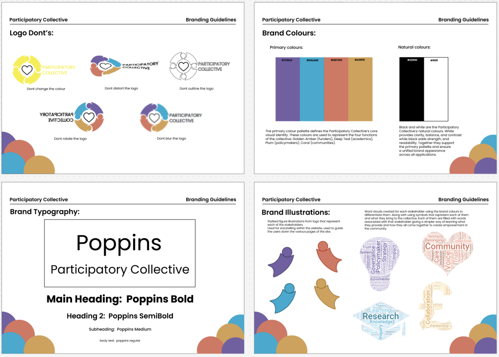
The colour palette was chosen to be vibrant yet grounded, reflecting both the warmth of community and the professionalism of research and policy. Golden Amber, “is a colour deeply tied to emotion and perception. Psychologically, it symbolises success and achievement and inspires optimism, prosperity, and high status.” (Ochwani, 2025) ,fitting for funders who provide support and sustainability. Teal Blue, “is seen as a sign of stability and reliability. Businesses that want to project an image of security often utilise blue in their advertising and marketing efforts.” (Cherry, 2024) ,representing academics and the pursuit of knowledge. Plum Purple, “is associated with a variety of meanings, including wisdom, creativity, royalty, power, ambition, and luxury.” (Cherry,2024) ,aligning with policy makers who guide and influence change. Coral Red, “the psychology of the colour coral suggests that its energetic nature not only encourages excitement but also fosters a sense of friendliness and warmth.” (Agrawal,2025) ,symbolising the community members who give life and meaning to the project.
Together, these colours work harmoniously, evoking feelings of balance, inclusivity, and creativity. They also stand out well against light and dark backgrounds, ensuring strong visibility and accessibility across different platforms.

Typography and Accessibility
For typography, I selected Poppins as the brand font. It’s a geometric sans-serif typeface known for its clean structure, open shapes, and friendly appearance which complement the logo well. Different weights of Poppins (Bold, SemiBold, Medium, and Regular) are used to create clear hierarchy across headings and body text. This makes it easy to read and navigate across both print and web formats. From an ethical design perspective, Poppins is an accessible and inclusive choice. Its high legibility makes it suitable for users with visual or reading difficulties, and it performs well across all devices and screen sizes. The rounded forms of the letters also match the curves of the logo, reinforcing a sense of consistency and harmony across the brand identity. The colour contrast between the typography and background has also been considered to ensure strong readability and compliance with accessibility standards, meaning the website and materials will be clear and inclusive for all users.
Overall Brand Feeling
The Participatory Collective brand is designed to feel open, approachable, and collaborative. Every element from the linked figures in the logo to the colour palette and typography reinforce the values of connection, empathy, and shared purpose. The visual identity is not just about aesthetics; it’s about communicating what the Participatory Collective stands for, people from different backgrounds coming together to make positive, community-led change.
References:
Jayshree, O. (2025) Gold Color Meaning and Psychology in Design. Available online: https://octet.design/journal/gold-color-meaning/ [Accessed 26/10/2025].
Kendra, C. (2024) The Color Blue: Meaning and Color Psychology. Available online: https://www.verywellmind.com/the-color-psychology-of-blue-2795815 [Accessed 26/10/25].
Kendra, C. (2024) What Does the Color Purple Mean? Available online: https://www.verywellmind.com/the-color-psychology-of-purple-2795820 [Accessed 26/10/25].
Sakshi, A. (2025) Coral Color Meaning, Psychology, And Importance. Available online: https://octet.design/journal/coral-color-meaning/ [Accessed 26/10.25].
Figjam Board: