As part of my design research for the Participatory Collective, I’ve been looking closely at the online presence of local and national community groups connected to the Ideas Fund, especially those based in Hull. These groups offer valuable insight into how community-focused organisations communicate care, trust, and inclusion through design and how differences in funding can directly shape how accessible or polished their digital presence is.
Through my FigJam research board, I compared how each of these communicates with their audiences, not just through words, but through design choices, layout, colour, imagery, and tone.
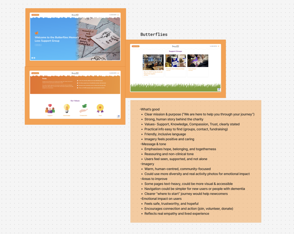
Butterflies Memory Loss Support Group
Butterflies is a Hull based group supporting people living with memory loss or dementia, as well as their carers. Their website immediately feels warm, welcoming, and personal. The mission is clear from the opening line, they’re here to help people “live well” with memory loss and their values of Support, Knowledge, Compassion, and Trust are prominently stated.
Visually, the website uses friendly imagery and an approachable tone. The layout is quite traditional and information focused, which makes it easy to navigate for older users. However, some pages feel text heavy, and the overall design could be simplified for even greater accessibility, particularly for visitors with cognitive challenges.
Despite that, Butterflies succeeds in making users feel safe, supported, and understood. It’s clear that every design choice, from the soft colours to the honest language reflects the groups empathy.
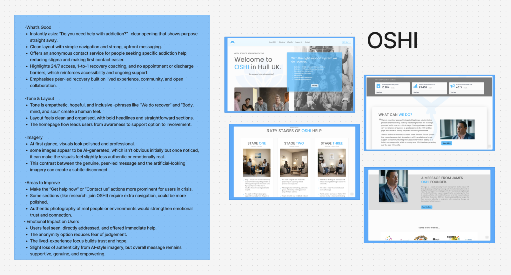
OSHI (Open Source Healing Initiative)
The OSHI website takes a very different approach. The first thing users see is the question: “Do you need help with addiction?” This direct message instantly establishes purpose and connection, speaking straight to those who might be seeking help.
The site feels modern, clean, and professional, with strong typography and a simple layout that’s easy to move through. It offers anonymous contact options, which makes it accessible to people who might feel anxious about reaching out. The tone is compassionate and hopeful, focusing on peer-led recovery and lived experience.
However, I noticed some of the imagery appears to be AI-generated, something not obvious at first but noticeable on closer inspection. While the visuals look polished, that synthetic feel can slightly weaken the site’s authenticity. For an organisation rooted in real human experience, using more genuine photography could help create a stronger emotional bond with visitors.
Overall, OSHI’s website is clear, empathetic, and user-friendly, but it could enhance its authenticity through imagery that better reflects real life.
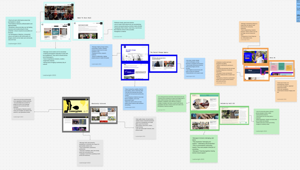
Wider Research: Nesta and National Organisations
Looking at larger organisations like Nesta (UK innovation agency for social good) offers a sense of what a well-resourced, future-facing site can achieve. Nesta’s design is bold, modern, and visually engaging, with dynamic colour use and clean typography. Their layouts are highly accessible, using strong visual hierarchy, large headings, and generous spacing to guide the reader.
They also model good ethical design practice having clear contrast for readability, inclusive imagery, and structured content that supports users of all learning levels. It’s a good example of how innovation and social purpose can be visually aligned through careful, human-centred design.
Reflections on Web Presence and Funding
When comparing these sites and others that I researched on my fig jam, it becomes clear that funding directly impacts visibility and accessibility.
Some local community groups have robust websites and active social media, while others have little or no online presence at all. Often, smaller groups have the heart and community connection but lack the resources to maintain a digital platform.
This inequality in web presence doesn’t just affect how organisations look, it affects how people find them, how accessible their help is, and ultimately how communities connect. The more funding and design support a group has, the more they can expand their reach and tell their story effectively online.
Ethics, Accessibility, and Emotional Design
Across all these sites, ethical design and accessibility play a key role in how users feel. A well designed community website should be easy to navigate for users of all ages and abilities, use clear compassionate language, avoid overly polished visuals that feel disconnected from real life, prioritise trust, clarity, and inclusion above visual “flashiness.” When design is done well as seen in the Butterflies’ warmth, OSHI’s direct language, or Nesta’s clarity, the result is a sense of belonging and empowerment. The site doesn’t just share information, it makes the user feel part of something meaningful.
Inspiration for the Participatory Collective
These examples have helped me think about how the Participatory Collective website can tell a story visually, balancing authenticity with clarity, and inclusivity with strong design.
Each user group (funders, academics, policy makers, and community members) will have a space where their perspectives are represented, not just through words, but through visual storytelling, including illustrations that symbolise each group.
By learning from these existing organisations, the goal is to design something that feels real, ethical, and emotionally resonant, a digital space that welcomes everyone into the collective.
References:
The Ideas Fund (2023) The Ideas Fund | Projects Available online: https://theideasfund.org/projects/projects?area[0]=5664 [Accessed 26/10/25].
Nesta (2025) Nesta | UK innovation agency for social good. Available online: https://www.nesta.org.uk [Accessed 26/10/25].
Figjam Board: