In this blog post, I’ll be showcasing the High-fidelity design of the Watchpoint app, a fleshed-out version that brings together branding, colour, UI/UX interactions, and user functionality. This version builds directly on my low-fidelity designs but now includes the complete Overwatch-inspired visual system, interactivity, and mobile friendly accessibility.
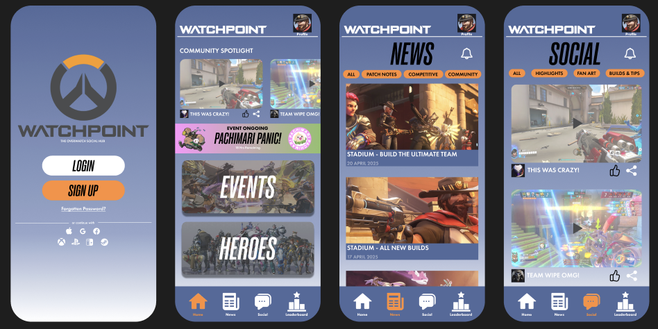
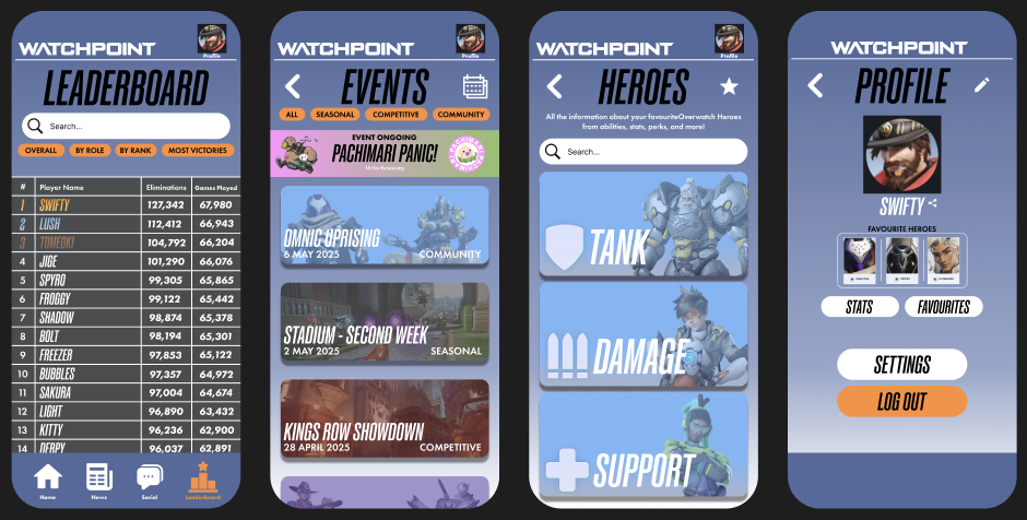
Watchpoint uses a strong and consistent colour palette based on the Overwatch brand- blues, greys, orange, and white. These colours were chosen not only for visual appeal but also for strong contrast, making the interface highly accessible. Key buttons, icons, and labels are designed with enough contrast to remain clear and easy to read against the background.
Onboarding
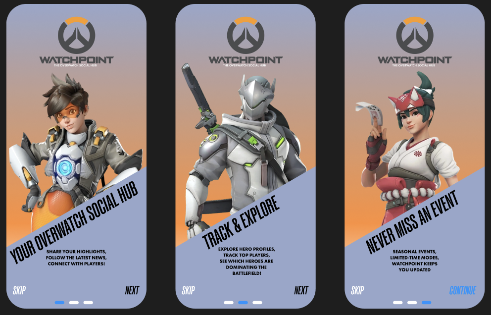
After users log in, they’re greeted with a short onboarding sequence that introduces them to Watchpoint’s key features: community highlights, stat tracking, and events. This walkthrough helps new users quickly understand what the app offers without overwhelming them, creating a confident first-time experience.
Some buttons in the high-fidelity prototype are fully interactive- when tapped, they respond visually by changing colour to simulate a pressed state. Since mobile devices don’t support hover effects, this feature gives users immediate feedback and reinforces usability.
I also implemented a side-scrolling feature on the home page, where users can swipe through content such as community highlights.
To keep navigation seamless, the navigation bar and app logo remain fixed on screen, even as you scroll. This persistent navigation system allows users to switch between pages at any time without needing to scroll back up. Additionally, the icon for the current page highlights automatically, giving visual feedback and helping users understand where they are in the app.
Branding Integration & Imagery
The high-fidelity design features a range of official Overwatch artwork and imagery to help reinforce the app’s connection to the game. These images were sourced from a range of official Overwatch websites and are solely for illustrative purposes in this project. All in game images are screen shots I have taken myself from my own gameplay and while the images themselves are not my own, all news content, event names, button designs, and UI elements are original creations made specifically for Watchpoint.
Reference Imagery:
Blizzard Entertainment (2023) REP YOUR FAVORITE OVERWATCH 2 HERO WITH NEW BATTLE.NET AVATARS! Available online: https://overwatch.blizzard.com/en-us/news/23935224/ [Accessed 5/5/2025].
Blizzard Entertainment (2025) HEROES. Available online: https://overwatch.blizzard.com/en-us/heroes/ [Accessed 5/5/2025].
Blizzard Entertainment (2025) NEWS. Available online: https://overwatch.blizzard.com/en-us/news/ [Accessed 5/5/2025].
Overwatch Wiki (2025) Pachimari. Available online: https://overwatch.fandom.com/wiki/Pachimari [Accessed 5/5/2025].
Overwatch Wiki (2025) Heroes. Available online: https://overwatch.fandom.com/wiki/Heroes [Accessed 5/5/2025].
Overwatch Wiki (2025) Maps. Available online: https://overwatch.fandom.com/wiki/Maps [Accessed 5/5/2025].
Figma Board: