This blog post will focus on typography and branding for the Rogue gaming convention, and it follows on from Post 3 by continuing to develop the event’s visual identity. It explores how font choices and stylistic details not only shape the brand’s personality and tone, but also play a key role in the overall UI and UX design. Thoughtfully selected typography helps create a consistent, recognisable look while enhancing readability, navigation, and user interaction across platforms.
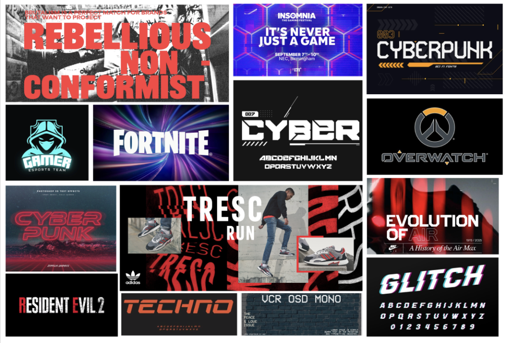
To help guide the typography and branding direction, I created a mood board that brings together a variety of fonts and typographic aesthetics. It features bold and sleek letterforms, with a mix of cyber-inspired typefaces that give off a futuristic and energetic feel which is perfectly suited for the vibe of a gaming convention. Included are examples of typography used in sports advertising, particularly from Nike and Adidas campaigns, where bold white text is layered over high-impact visuals to create a strong, attention-grabbing image. The mood board also incorporates imagery and design elements that complement the typography, showing how type and visuals work together to communicate a unified style. Additionally, I included logos from popular games like Overwatch and Fortnite, which both use bold, stylised lettering that feels modern, which is the approach I’d like my branding to reflect as I develop the ROGUE identity.
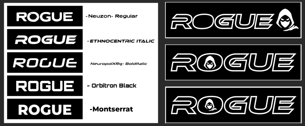
As I moved into developing the early designs for the ROGUE logo, I began by testing five different fonts that I felt matched the futuristic and bold aesthetic I was aiming for. These included Neuzon Regular, NeuropolXRg Bold Italic, Orbitron Black, Montserrat, and Ethnocentric Italic. After experimenting with each, Ethnocentric Italic stood out as the strongest fit for the ROGUE logo. I felt it captured the sleek, cyber inspired look I was going for, and its italicised form added a sense of movement and energy that aligned perfectly with the vibe of the convention.
While, Ethnocentric Italic became the primary font for the logo, Montserrat was chosen as the main typeface for the website due to its clean lettering and strong readability, ensuring a smooth and accessible user experience. The final logo design also includes an illustrated figure resembling a rogue like game character, which was inspired by an image i found during the mood board research. I created a new Rogue image using the pen tool in Adobe Illustrator, adding a unique and personal touch to the visual identity of the brand.
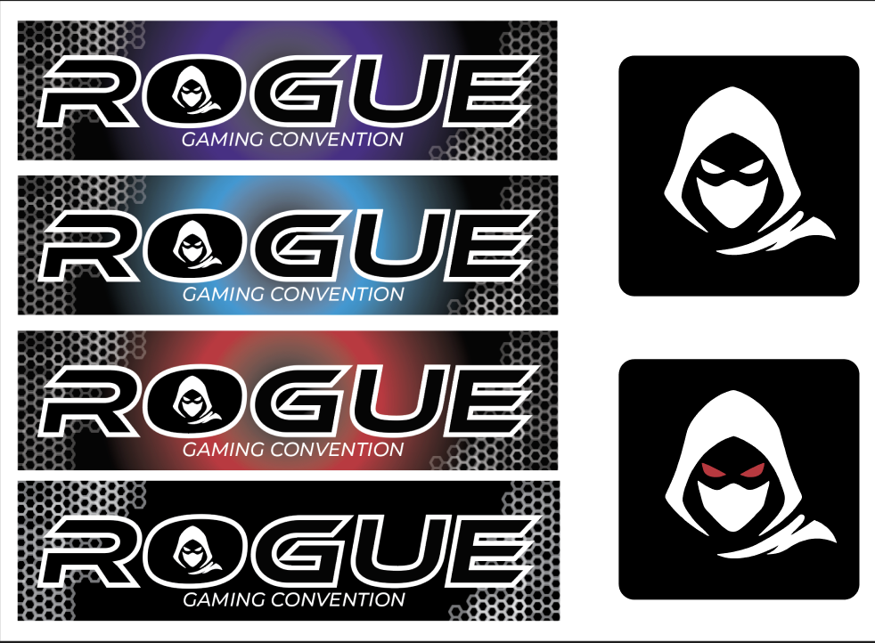
The finalised drafts of the ROGUE logo incorporate all the chosen colours creating a cohesive and visually striking design. The logo itself is primarily black with a white stroke around the text, which really helps it stand out against both light and dark backgrounds. This white outline also ties in seamlessly with the white illustration of the rogue-like character, bringing the entire design together in a clean and unified way. A subtle hexagonal pattern has also been added to the background, contributing to the cyber-futuristic aesthetic that runs throughout the brand. While I’m still undecided on whether this pattern will remain in the final version, it currently serves as a strong placeholder and adds texture and depth to the overall look which will be present on the website background.
Alongside the main logos, there’s also an image of the rogue logo, offering an alternate version of the design, One of these variations features the character with red eyes, which gives it a more intense and dynamic edge. This version is intended for use as the companion app icon on mobile and tablet devices, making it a strong choice for smaller spaces where a simplified logo is needed without losing brand recognition.