This blog post will focus on the development of key design elements such as imagery, colour, typography, overall aesthetic, and how each component works together to create a cohesive visual identity that not only looks appealing, but also communicates my gaming festivals personality- with the help of user feedback.
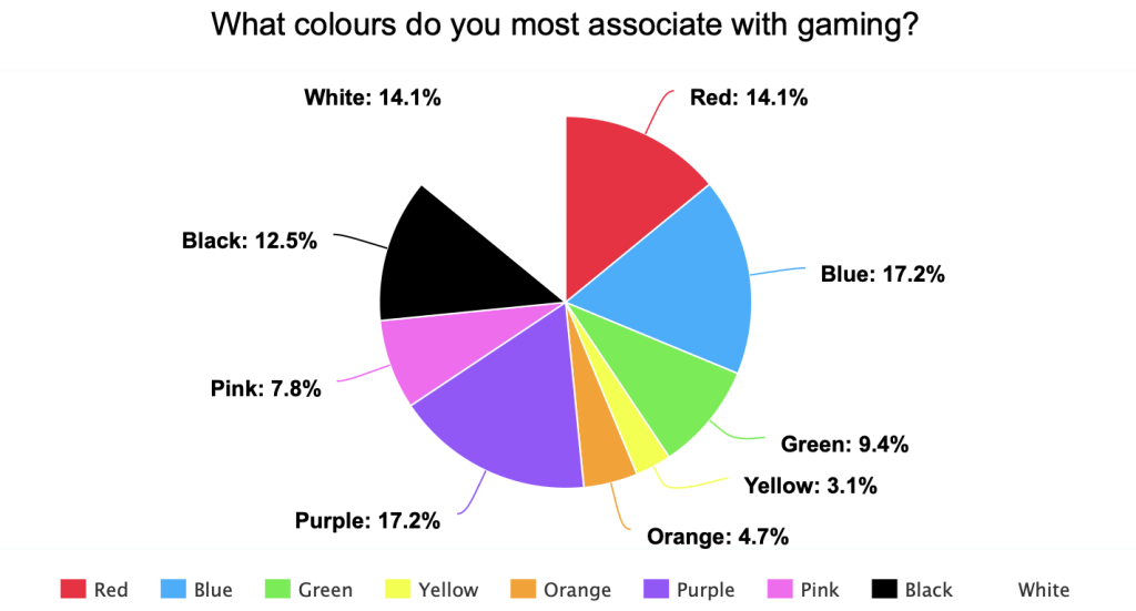
To help guide the colour palette for the website and overall branding, I collected user feedback by asking what colours they most associate with gaming. The responses were shown using a pie chart, which revealed that the most popular choices were blue, purple, red, black, and white. By gathering this data, I was able to shape the mood board around these preferred colours and focus on researching existing aesthetics, styles and design trends that effectively use these colours within the gaming festival space.
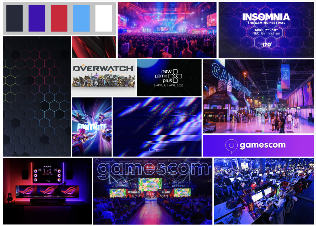
A detailed mood board was created to explore and define the visual direction, aesthetics, typography styles, and design inspiration shown from competitor gaming festivals. This helped establish a strong foundational understanding of the current industry standards while also identifying opportunities to differentiate from them. The mood board includes a selection of images taken at various gaming festivals, showcasing vibrant colours, and capturing the glowy aesthetic that’s often associated with gaming events. One of the most prominent design elements within these visuals is the use of hexagonal patterns, which help create a modern, tech-inspired feel. While I like the idea of hexagonal patterns and how they contribute to that futuristic vibe, I’d like to experiment with creating something different for my own branding.
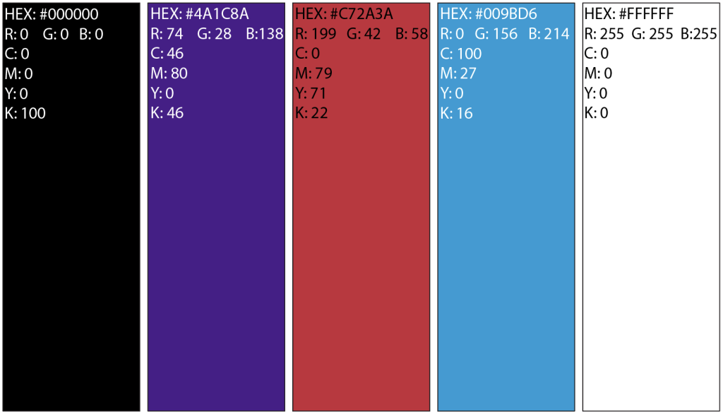
The chosen colour palette for the ROGUE gaming convention were these various shades of black, blue, red, and white were carefully selected to support both visual appeal and functionally. Black will serve as the base colour for the website, as it’s easy on the eyes during extended viewing and perfectly complements the sleek, futuristic aesthetic of the ROGUE brand ,Lana (2024) says a black background improves visual focus and naturally draws the viewer’s attention to key elements like text, images, and call-to-action buttons. Using black as a foundation also allows accent colours to stand out more vividly. Blue, purple, and red will be used strategically for interactive elements such as buttons and call-to-action features, helping to guide users through the site and clearly indicate active states, like which page they’re on. These vibrant tones not only add energy to the overall design but also improve accessibility by creating strong visual prompts. White will be used for the text across the website, as it offers high contrast against black backgrounds and enhances readability. It also works well as a neutral accent that pairs effectively with any of the other colours. All of these colours are reflected in the ROGUE logo, creating a consistent and unified visual identity across the branding.
References:
Lana (2024) Black Websites: Design Trends and Best Practices. Available Online: https://thewhitelabelagency.com/black-websites/ [Accessed 9/4/2025].