This blog post will focus on the design, research, and ideation process behind the creation of Watchpoint. This is a companion social hub app designed for the popular team-based shooter Overwatch, developed by Blizzard Entertainment. Watchpoint will be developed with both UI (User Interface) and UX (User Experience) principles in mind, ensuring the final product is not only visually engaging, but accessible, and enjoyable for Overwatch players of all skill levels.
To start the design process, I began by using the crazy 8s ideation activity. This helped me quickly generate a variety of layout concepts and feature ideas that could shape the foundation of the Watchpoint app. The speed of this method allowed me to think creatively, leading to some surprisingly strong starting points.
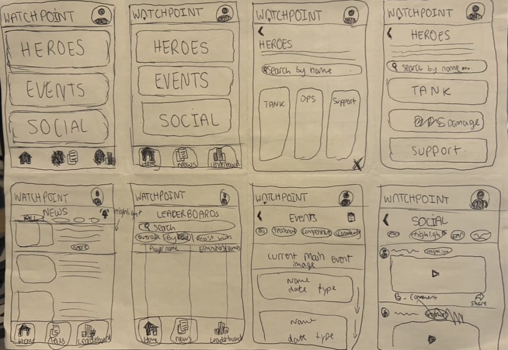
All of my ideas were based off my own knowledge and experience of Overwatch, with a strong focus on how the game could be as a social companion experience. I considered what kind of content players might want to see, from highlights and stats to events and community interaction.
Competitor Research
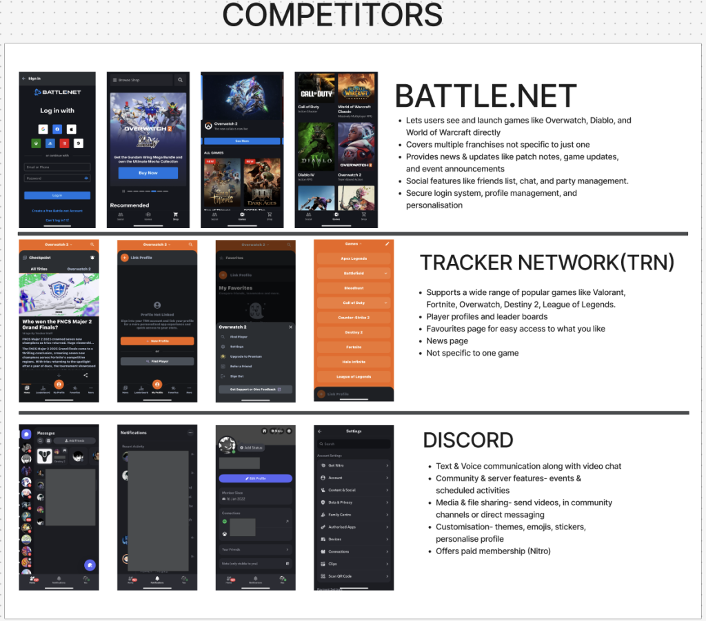
To help shape the features and aesthetic of Watchpoint, I conducted competitor research by exploring apps and platforms with strong ties to gaming communities. Battle.Net, TRN, and Discord each offer a valuable insight into how social features, stat tracking, and user engagement are handled in an app.
From Battle.Net and TRN, I drew inspiration from their news and updates sections, event announcements, and the use of leaderboards to showcase top performing players. TRN’s stat driven design helped guide my own ideas for integrating player data and hero usage in a clear way.
Discord was useful when thinking about community-building, messaging, and profile customisation. The way users interact, share media, and join different servers inspired the community and highlight-sharing features I planned for Watchpoint. I also noted the importance of a flexible login system that supports multiple sign-in methods, something all three competitors handled well.
Alongside this feature planning, I put a strong emphasis on UI and UX design. I wanted the app to be visually aligned with Overwatch’s sleek style while also being highly usable. Colour contrast played a huge role in ensuring buttons, icons, and text were always clear and accessible on any background. High-contrast colours help users navigate quickly, and a clear navigation bar with labelled icons ensure users move between the core areas. Watchpoint will include Home, News, Social, Leaderboard, and Event pages along with onboarding to help the user when first entering the app.
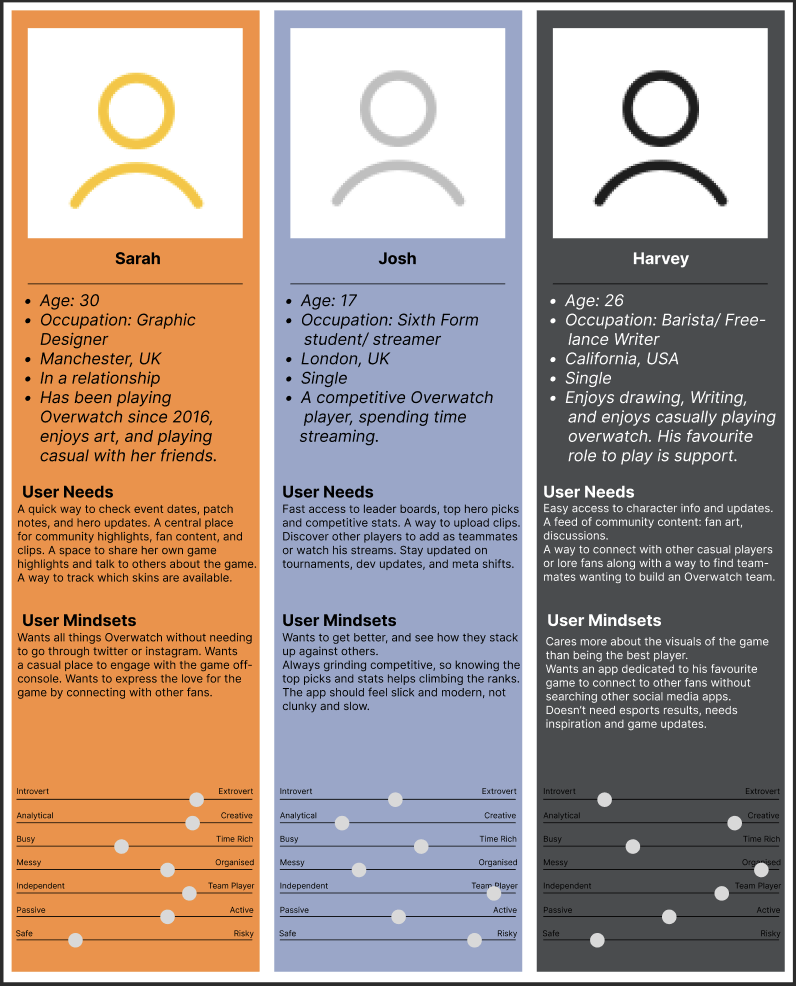
Personas
Moodboard
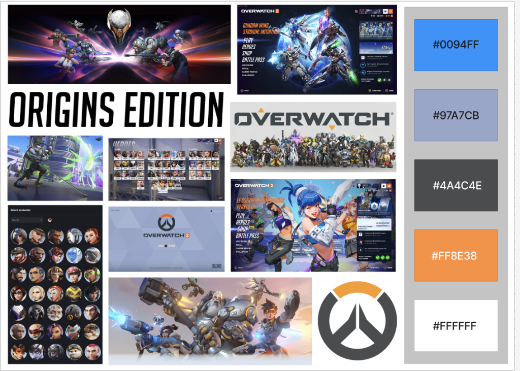
I created this mood board that captured the essence of the game. The colour palette I chose was directly inspired by Overwatch’s branding, which features a bold combination of blues, greys, orange and white. The blue and grey tones offer a sleek, tech feel, while the orange and white adds vibrancy and is going to be used to highlight text and call- to-action buttons. When using a complementary scheme, it is important to choose a dominant colour and use its complementary colour for accents (Babich, 2017).
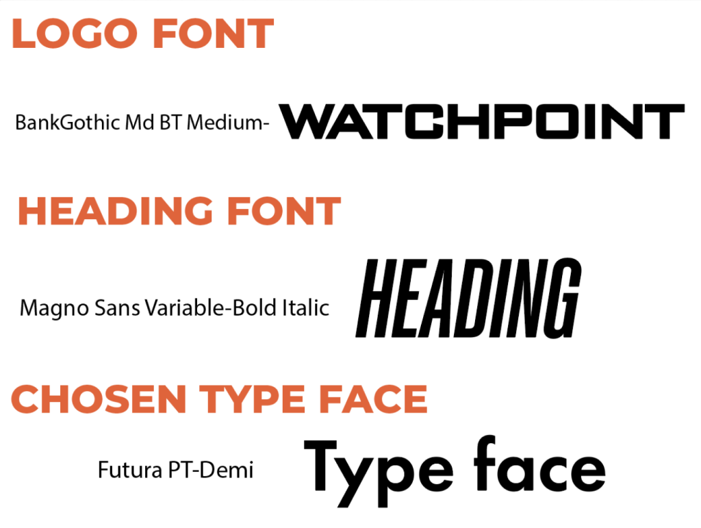
For typography I chose to use fonts that felt closest to the ones used in game, along with being readable for body text:
LOGO
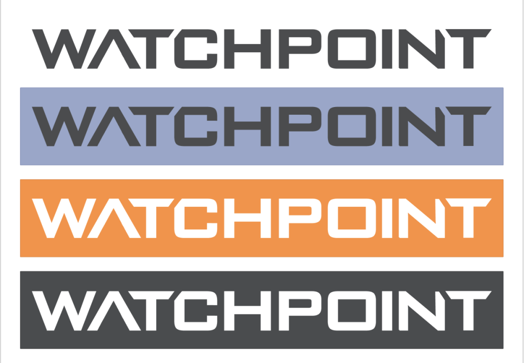
The logo for Watchpoint is a custom font I designed using the BankGothic Md BT Medium font which is the one Overwatch’s logo is made from. The logo was created in Adobe Illustrator, allowing me to fine-tune the spacing, angles, and layout to closely match the bold futuristic feel of Overwatch’s branding. The result is a logo that feels instantly familiar to fans of the game, helping reinforce the app’s authenticity and connection to Overwatch.
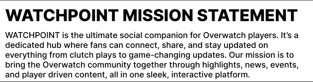
Mission Statement
References:
Nick, B. (2017)The Underestimated Power Of Color In Mobile App Design. Available online: https://www.smashingmagazine.com/2017/01/underestimated-power-color-mobile-app-design/ [Accessed 5/5/2025].
Mood board Imagery:
Overwatch (2025) Available online: https://overwatch.blizzard.com/en-us/news/23935224/ [Accessed 5/5/2025].
Screen shots taken myself from the actual game- Blizzard Entertainment (2025) Overwatch 2 . Irvine, CA: Blizzard Entertainment.
Figjam Board