Typographical standards ensure consistency, professionalism, and recognisability for a brand. Creating a solid brand identity means having consistent typography, specific colours, illustrations and multiple logos. These ensure the brand thrives and keeps with its identity while helping the customer differentiate the brand from others.
SHARDNEX Typographical Standards
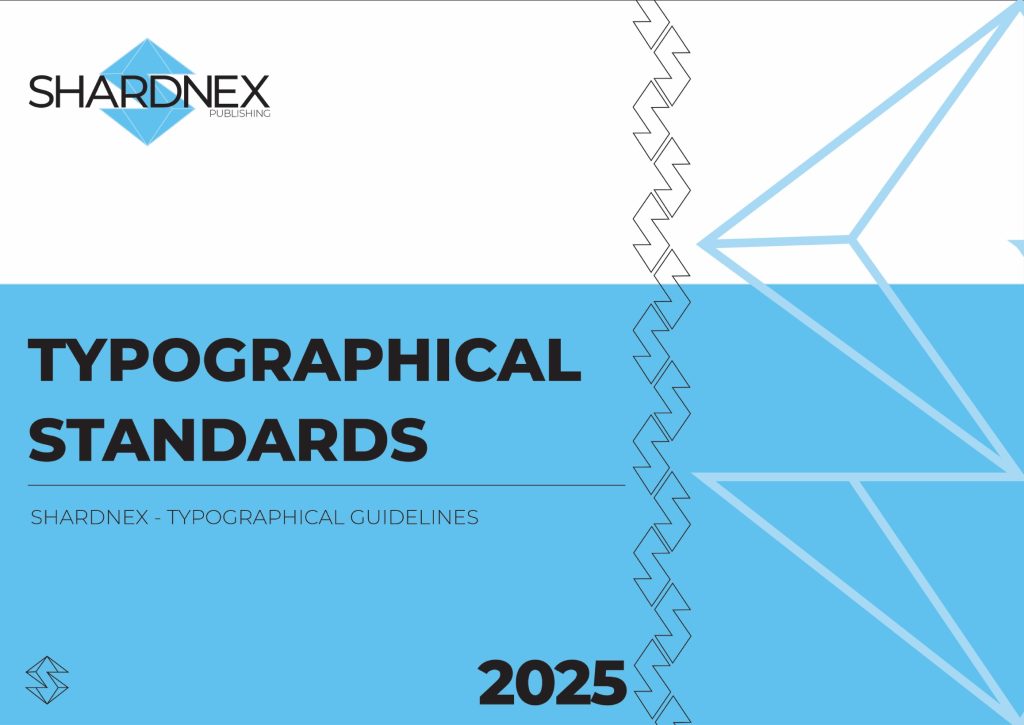
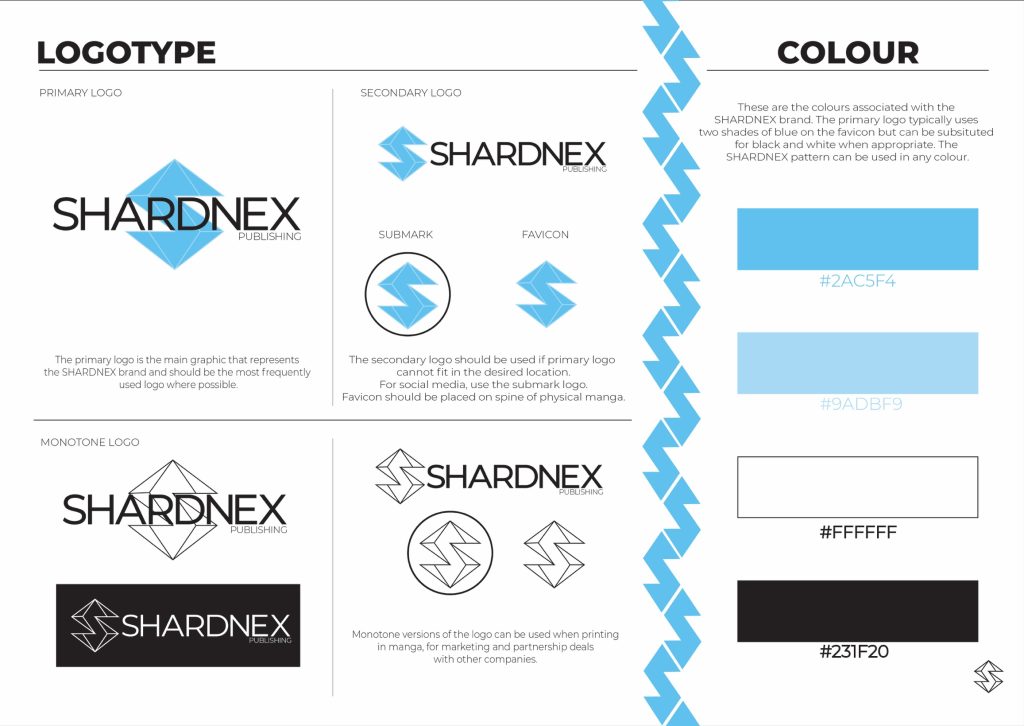
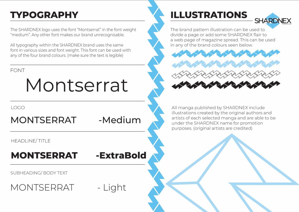
I chose the task of creating typographical graphic standards for a publishing company that’s purpose is to promote and sell manga to 15-25 year olds. When creating the name for my publishing company, I wanted it to sound modern and sleek while also having an edge.
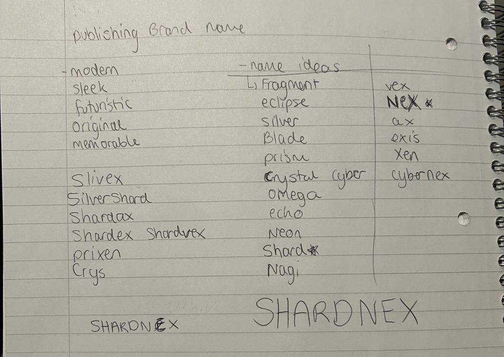
Ultimately this led to me writing down a list of words I found striking and what would make you want to buy from the company. I ended up with SHARDNEX which is a combination of “shard” which is linked to jewels and “nex” which is the archaic form of “next” which means “the future of manga!”
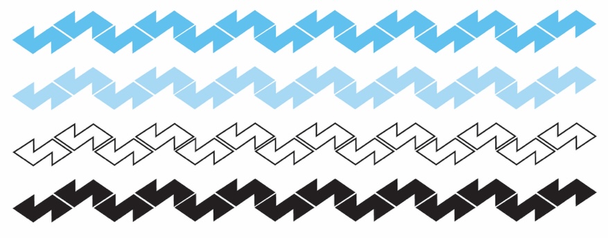
After creating the name for my brand I chose colours, that were appropriate with the name and the modern aesthetic I was looking for. The word shard made me think of shiny jewels and ice shards which led me to choosing two shades of light blue. Pairing these colours with black and white elevated the blue colour making it stand out. These four colours would be the ones that the brand SHARDNEX identifies itself with and helped creating a professional looking logo. The four colours would be used within the logo and in the brands signature pattern. The SHARDNEX pattern was created by using the “S” shape found in the primary logo for the company and it fits well together when pieced together. This pattern would be used as either a page divider or as a way to add a pop of colour to magazine spreads and web pages.
When choosing the typography for my brand, I wanted it all to match and look similar to the logo, but look different enough so you can differentiate if it’s a headline, subheading or body text.
To find the right font for the SHARDNEX brand I took to adobe illustrator and viewed the brand name in many different typefaces. Since I wanted the brand to look modern and sleek I opted for a simple and sharp look. I feel a font like that would fit the brand’s identity with the sharp edges of ice in mind and a clean cut jewel.
Montserrat was the chosen typeface for SHARDNEX as it had all the qualities I was looking for. The simple and straight edges the letters have project a professional and tidy look. It also complements the brands main logo with the thin letters. This typeface would be used all throughout any branding with the SHARDNEX name and in all weights ranging between ‘light, medium and extra bold’ The logo of SHARDNEX using the medium version as it didn’t feel to heavy against the logo.
In future I would like to include the correct spacing and the use of the brand on the actual manga books into the SHARDNEX typographical standards.