The company logo is essential for a business because it serves as the face of the brand and plays the important role in establishing its identity. It also acts a symbol that visually represents the company’s values, mission and industry. A unique and well-crafted logo makes the brand easily recognisable and helps customers remember the company.
SHARDNEX Publishing’s Conceptual Logos
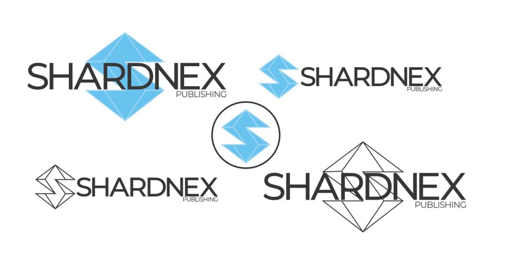
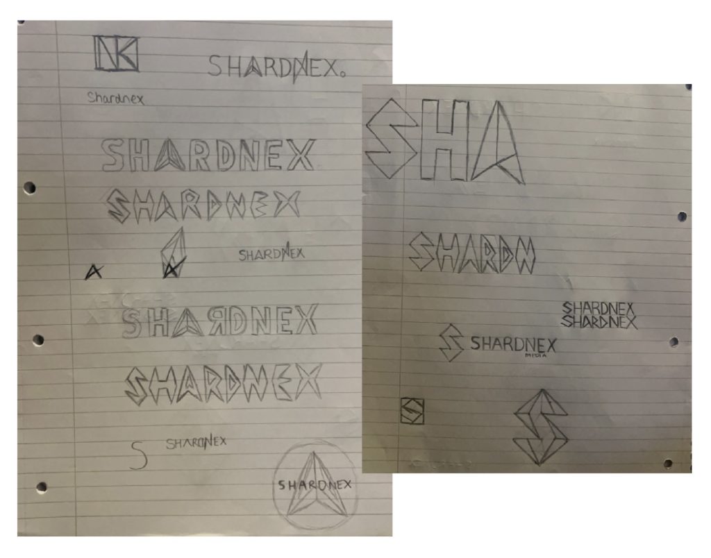
To create the conceptual editorial masthead (logo) for the brand SHARDNEX I wanted it to be striking but in a subtle way. SHARDNEX’s aim is to promote and sell books and manga physically and digitally to a target audience of 15-25 year olds I didn’t want the logo of the brand to be childish. It needed to look sleek and professional so a simple look would be fitting. When coming up with ideas for the logo I was originally going to my own typeface however I felt that if I used one that already existed i could edit it enough to make it my own.
After looking through various typefaces I found ‘Montserrat’ which is the one I chose for the logo. More specifically it’s Montserrat in the medium font weight. Out of all the font weights the medium one looked thick enough to stand out on its own while being thin enough to not overpower the “S” logo. It creates a nice balance between the sub-mark and the text logo. The clean, sans- serif font feels modern and professional, complementing the futuristic and create nature of manga. It’s legible and aligns well with the bold style of manga branding.
When creating and designing the brand sub-mark it needed show what the typeface didn’t so to link it to the brand name I designed an ‘S’ to look like a jewel / ice shard. The geometric shapes and minimalistic approach gives the logo a simple look but with a big conceptual meaning. The logo being blue supports the idea it being an ice shard and the pop of colour creates a visual heirarchy making it more appealing without overwhelming the design. The angular ‘S’ icon stands out and I think it’s a strong brand identifier. The sharp edges and symmetry reflect the creativity and precision which I think resonates well with the manga industry and its sharp and hard hitting illustrations within the books.
The logo is also fairly versatile and works well in both monotone and colour versions. The use of black and white ensures it’s scalable and adaptable for various applications like print, digital and merchandise.