Manga front covers are designed to captivate readers instantaneously, blending art and story to create an appealing first impression. They include striking artwork using vibrant, detailed illustrations often showcasing the main characters usually in dynamic poses or expressive moments that reflect the story’s tone and genre. Bold and stylised titles often integrate seamlessly with the artwork, adding to the cover’s visual impact.
3 Manga Front Covers Published By SHARDNEX

When doing the planning for my three manga front covers I wanted them to each have a different genre and I wanted to the designs to be detailed, colourful and sleek. I tried to create three completely different manga that would appeal to different readers based on their genre.
The target audience of the manga is 15-25 year olds and I think each one of my covers is appropriate of this age demographic. The reason why the age demographic is 15-25 year olds is because some manga can cover violent or graphic topics and can include strong language which I don’t think is appropriate for anyone below age of 15. The reason my three manga covers don’t include any SHARDNEX branding is because typically the publishers name is usually on the spine, back and inside of the manga.
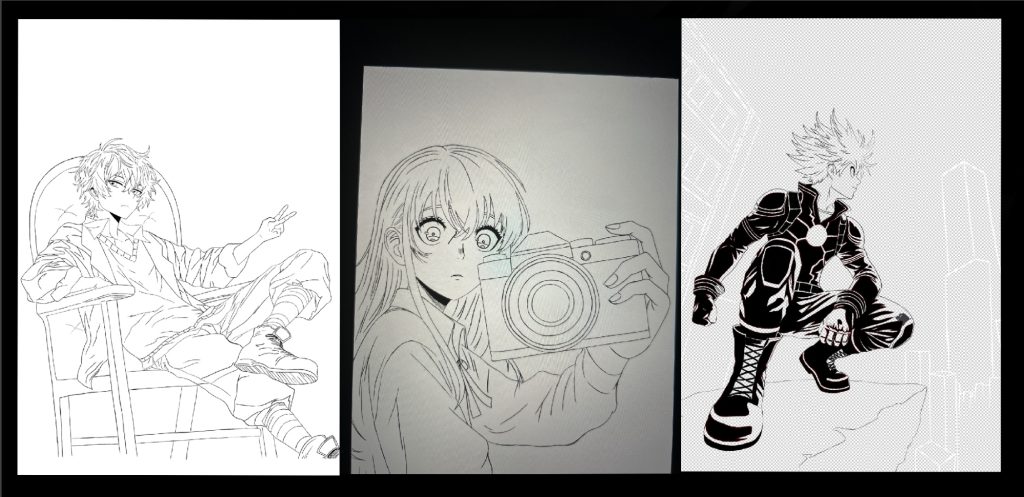
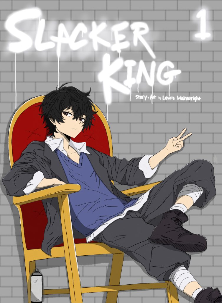
The first cover I created was the one titled “Slacker King” and its genre is comedy/ school. It’s about a high school student called Rika who is insanely strong but very lazy and the delinquent students notice how strong he is when he is forced into a fight by accidentally bumping into another student. The cover includes a conceptual title which has been spray painted on the brick wall background and includes drips for a more realistic effect. The royal looking chair hints to the fact Rika is seen as the king of the delinquents even though he didn’t mean to do it.
The second cover I created is titled “Spirit Lens” and its genre is horror/ psychological thriller. It’s about a university student called Shizuka who gets gifted a camera from her grandparents which gives her the ability to see spirits of dead people when looking through the lens. This then causes her to experience many problems and can’t seem to get rid of the camera. The cover has been stylised in a black, white and red colour scheme. This creates an eerie tone on the cover and the facial expression shows fear in her eyes. The title includes a camera inspired border and the red on the title I feel highlights the red in the camera lens which is there to symbolise the spirits, so it’s hard to notice at first.
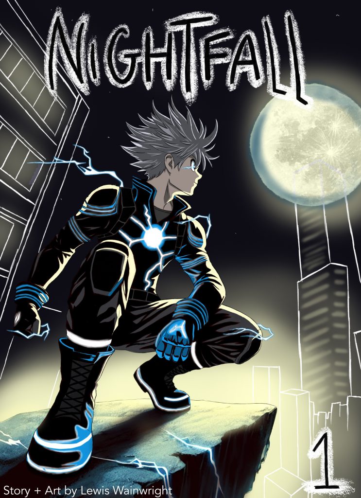
The third cover I created is titled “Nightfall” and its genre is supernatural/ action. It’s about a high school student called Hiro who is a regular student during the day and by ‘Nightfall’ he’s a superhero with electric powers who saves the world without anyone knowing by destroying countless enemies that keep appearing out of nowhere. The cover has a very mysterious vibe and very dark tones with the moon shining light on everything. The detailed glow effect is very eye catching and people will appreciate the level of detail put into it.